Table of Contents
Tips for Creating Your Best Nonprofit Websites
Medical Organizations Websites
Arts and Cultural Organizations Websites
Environmental and Animal Rights Organizations Websites
Community and Economic Development Organizations Websites
Youth Programs, Child Development, and Education Websites
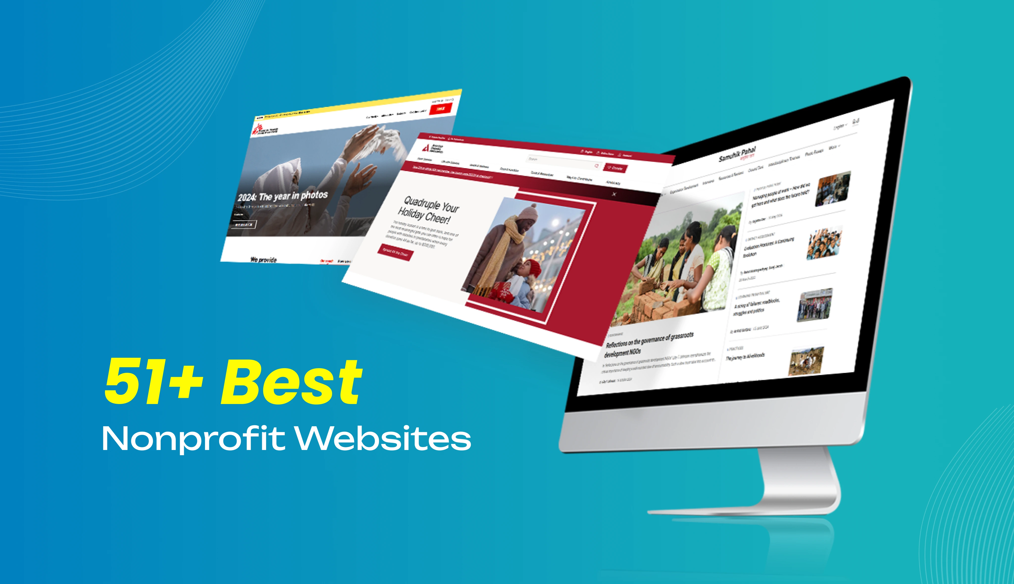
51+ Best Nonprofit Websites to Get Inspired in 2025
Have you ever wondered what makes a nonprofit website stand out? Identifying organizations that genuinely share their values and mission can be challenging, as so many of them are competing for global attention
Imagine browsing through a strongly designed website that effectively captures users’ interest and narrates its purpose of formation. Suddenly, you think about the factors that you are missing out on.
For your reference, we have listed some of the best nonprofit website designs with their specialties in our blog, 51+ Best Nonprofit Websites, demonstrating how powerful messaging and creative designs attract potential contributors.
Whether you are just getting started or on a path of upgrading your existing nonprofit website with professional nonprofit website design services, the following collection of inspiring nonprofit website design examples and some valuable tips will inspire your journey.
Let’s examine what makes these nonprofit websites stand out!
Tips for Creating Your Best Nonprofit Websites
- Choose a content management system platform that fits your website requirements.
- Design a simple website that can be easily accessible to everyone.
- provide proper and clear calls to action.
- Highlight your goals and missions properly.
- Keep the site mobile-optimized.
- Use a dedicated page or section to highlight your success stories.
- Integrate your organization’s social media profiles with the website.
- For better organic reach, keep the website SEO optimized.
Medical Organizations Websites
Fernandez Foundation
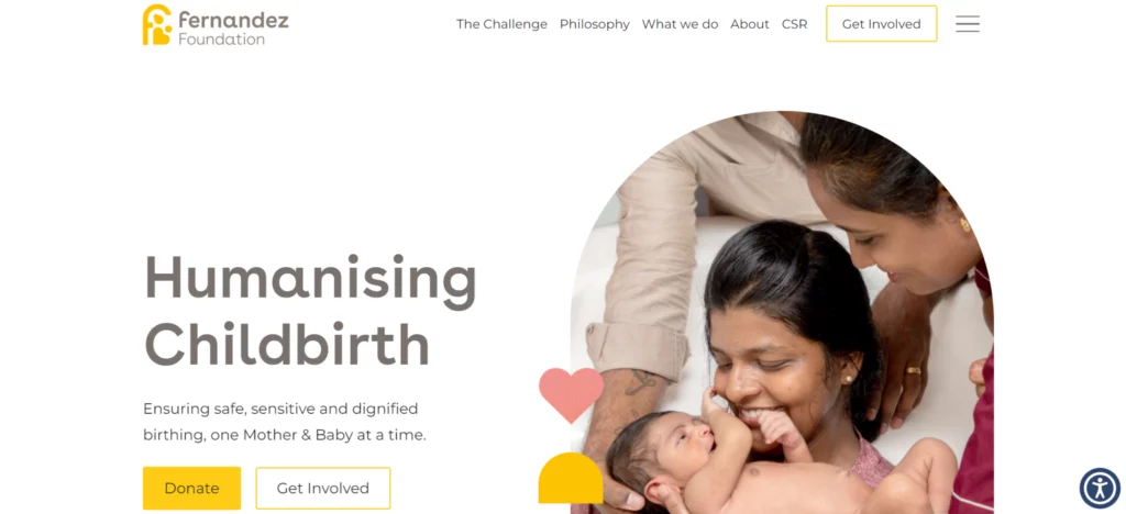
The Fernandez Foundation aims to ensure safe pregnancies and offer high-quality care for women and newborn babies. The website exhibits the mission through a user-friendly design that highlights its goals. It differs from conventional maternity care designs, which mainly use a yellow color that represents hope. The hero section can communicate the foundation’s objective through powerful taglines and impactful images. The addition of call-to-action buttons like Get Involved and Donate encourages the user to support the cause. Considering all of these factors, the design can convey the organization’s organizational objectives.
American Diabetes Association
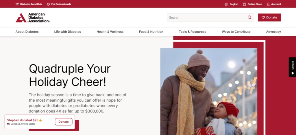
The American Diabetes Association is well known for providing necessary resources and support for individuals with diabetes. The design features a well-structured and user-friendly navigation bar providing diabetes-specific information. Accessibility is maintained throughout the design with high color contrast, adjustable text sizes, alt text for images, responsive design for a seamless user experience, and perfectly placed call-to-action buttons for attracting potential donations.
Alzheimer’s Association
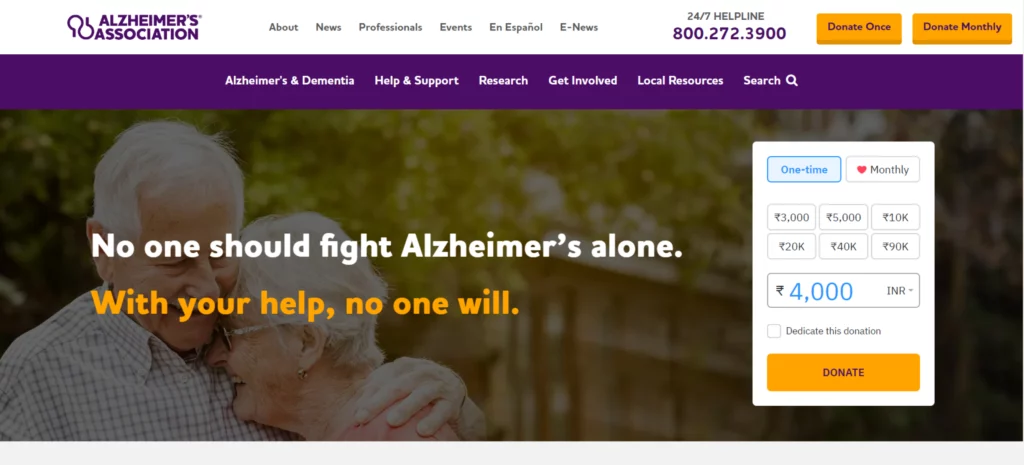
The Alzheimer’s Association’s main objective is to provide necessary support and resources to individuals affected by Alzheimer’s disease and their families. The website uses a soothing color palette of blue and white, emotional imagery for connecting the audiences, and a focus on accessibility—offering adjustable text sizes, alt text for images, and high-contrast text. The site is easy to navigate, works seamlessly across devices, and has compelling calls to action for visitors to participate in support groups or fundraising activities A donation form is in the hero section for giving the necessary donations
Cystic Fibrosis Foundation
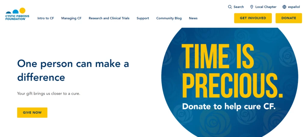
Cystic Fibrosis Foundation aims to improve the lives of individuals affected by cystic fibrosis. Its website features a vibrant color palette with yellow, purple, and various shades of blue. The hero section combines three images, offering a user-friendly layout with quick access to essential information. Accessibility features include adjustable text sizes, high-contrast text, and alt text for images. Prominent calls to action, such as “Get Involved” and “Donate,” are placed above the hero image, with a “Give Now” donation button located in the hero section.
Mental Health America
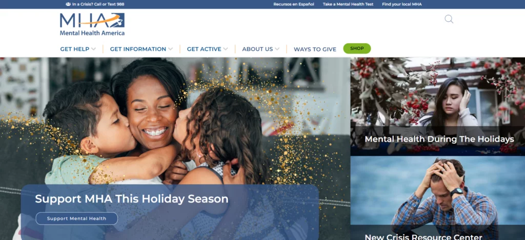
Mental Health America (MHA) promotes mental health and well-being helps people who are going through tough times, and provides care and resources needed for them to have a better and more peaceful life. The website shows this mission with a soothing design consisting of a color combination of blues, greens, and whites and a hero section featuring images that support mental health Visitors can easily navigate the site to access key features, including a donation form for contributions, a product sales page, and detailed information about the organization.
Canadian Blood Services
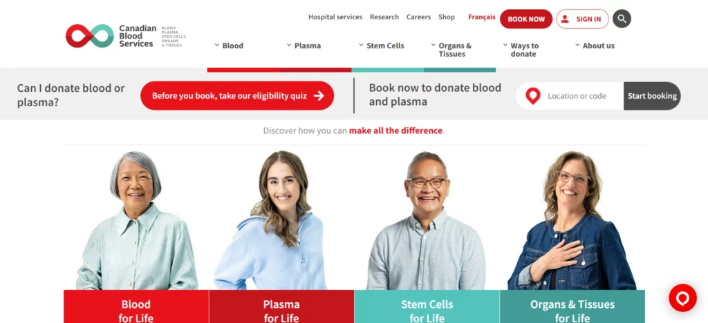
Canadian Blood Services’ motto is to encourage blood, plasma, organ & tissue, and stem cell donations and act as a centralized hub in Canada. The website follows a vibrant color palette of red, white, and shades of grey, as red symbolizes urgency and blood donation. The hero section can create an emotional connection and the impact of donations by showing real recipients’ images and providing a clear and organized layout. The responsive design, clear navigation, and high-contrast text maintain accessibility. The design strategically places calls to action like “donate,” “get involved,” and “book an appointment” in the hero section, thereby enhancing accessibility.
Mayo Foundation
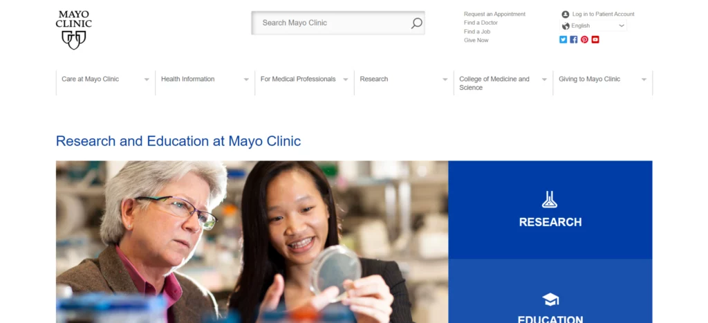
The Mayo Foundation gained popularity from its excellence in patient care, advanced medical research, and education. For creating a professional and trustworthy appearance, they use various shades of blue, grey, and white, as blue is often called a color that builds trust and security, and white and greys improve readability. Overall, the design features an easily accessible and well-organized menu bar providing all the necessary information. Accessibility is prioritized with the help of high-contrast text, keyboard navigation, and structured headings. Call-to-action buttons such as “Request an Appointment”, “Donate”, and “Find a Doctor” are properly arranged for better engagement and visibility.
Doctors Without Borders
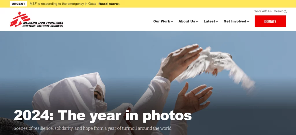
Doctors Without Borders’ primary objective is to provide medical care to people who are affected by conflicts, disasters, and epidemics. In the design, they use a color combination of red and white as it showcases the organization’s urgency toward the mission. A white background and dark-colored text improve contrast and readability, and the design features dedicated sections for ongoing missions, the latest news, and donations, making it easier for users to access the needed information. The use of real crisis images, patients receiving care, and medical professionals working in crisis areas helps in building trust and an emotional connection with viewers. Responsive design, alt text for images, and high-contrast text contribute to accessibility. Get Involved and Join Us are the important calls to action present.
Social Impact Websites
India Development Review (IDR)
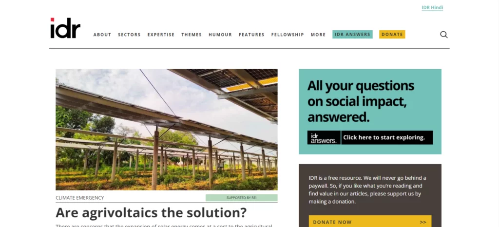
India Development Review (IDR) is a platform that offers valuable information about India’s social development sector and encourages knowledge sharing to tackle the country’s important social issues. The website follows a simple layout with a color combination of gray and white for improved user experience and readability. The site follows a grid structure for arranging the topics and articles, which makes it easily accessible to visitors. The hero section displays the most recent content. Use of a search option and an organized navigation bar, making it easier for users to access the contents. To meet user responsiveness, interactive components like hover effects on buttons and images are used.
Samuhik Pahal
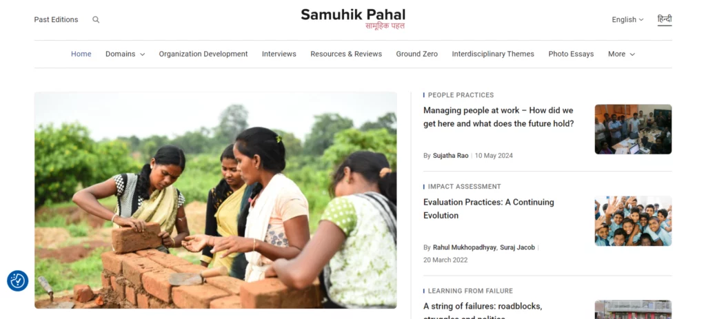
Samuhik Pahal is a comprehensive resource hub of the Wipro Foundation that empowers communities through education, sustainable livelihoods, environmental conservation, and skill development. The website focuses on a captivating and straightforward design through a color combination of crisp gray and white for easier reading. Accessibility is guaranteed for a wide range of audiences with multilingual support and content arranged in a flexible grid structure for improved readability, along with features like hover effects on buttons and images used as interactive features. The hero section highlights key articles and call-to-action buttons are positioned for further interactions. Overall, the design ensures a seamless user experience.
Arts and Cultural Organizations Websites
National Geographic
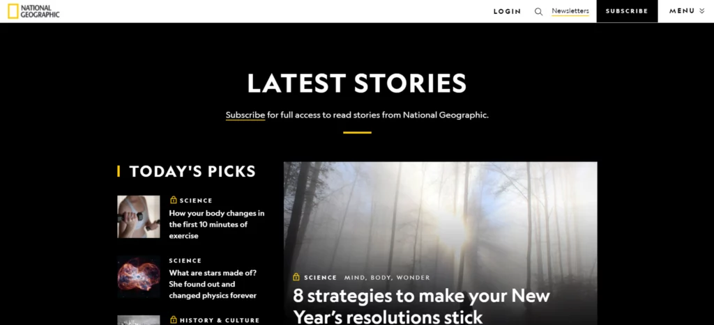
National Geographic is dedicated to exploring and protecting the planet through storytelling, research, and education. Its website embraces a simple and minimalistic design, featuring just four primary links: Login, Newsletters, Subscribe, and Main Menu. These links provide users with straightforward options to log in, subscribe, or renew their subscriptions. The home page features clear calls to action for newsletter subscriptions and buttons for subscriptions, which helps in creating a user-friendly experience. overall the design is a perfect example of a content-rich website with a clean layout.
Metropolitan Museum of Art (MET)

The Metropolitan Museum of Art (MET) attracts visitors through its educational programs, cultural initiatives, and exhibitions. The design focuses on a straightforward and user-engaging design. The home page itself is a great example of it as it provides direct information about the opening and closing details, ticket prices, etc. The header section provides important tabs for membership, ticket purchase, and donation. Overall, the design provides a complete user-friendly experience for all visitors.
UNESCO
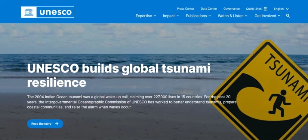
UNESCO (the United Nations Educational, Scientific and Cultural Organization) aims to promote sustainable development, peace, and cultural understanding on a global scale. UNESCO provides a clear and easy-to-navigate home page that consists of important information, projects, and event details. Important tabs like About Us, What We Do, and Get Involved are featured in the navigation bar. Multilingual support provides worldwide accessibility. User interaction is maintained through calls to action buttons such as donate, get involved, and learn more. Overall, the website’s responsive design guarantees a seamless user experience across various devices.
Smithsonian Institution
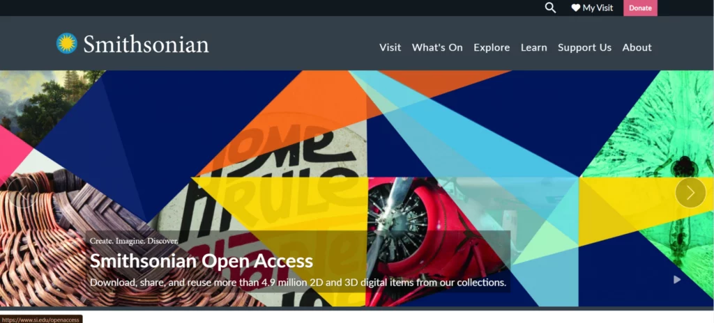
The Smithsonian Institution supports the preservation of cultural heritage, research, and education through its vast resources. Its website features a user-friendly design, with sections dedicated to planning visits, exploring events, and accessing digital resources. Navigation is streamlined with call-to-action buttons such as ‘Explore’ and ‘Plan Your Visit.’ High-resolution images effectively highlight key artifacts and events, enhancing user engagement. Additionally, the donation button prominently placed in the main menu provides visitors with an easy way to support the Institution’s mission.
Philadelphia Museum of Art
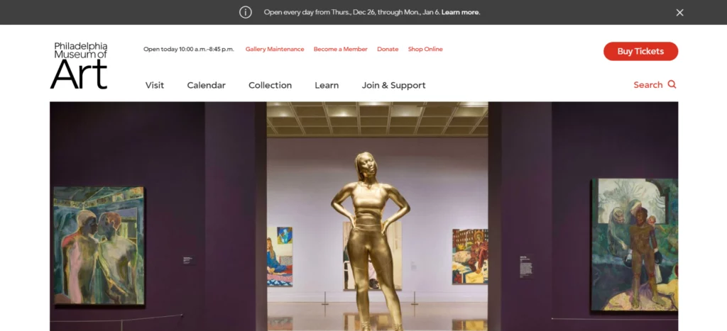
The Philadelphia Museum of Art acts as a hub for cultural and civic resources. The design provides a seamless and user-friendly experience for visitors and guides them to key information. The visit tab provides details about the directions to visit and ticketing details. The calendar tab describes current and upcoming events; the collection tab provides an overview of museum art collections, and the join and support tab highlights donation opportunities and membership benefits. The integration of a search bar and call-to-action buttons improves the overall user experience.
The Museum of Modern Art
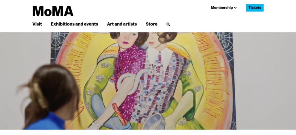
The mission of the Museum of Modern Art (MoMA) is to introduce modern art and culture to people across the globe. Design-wise, the key information is easily accessible through the user-friendly design with the help of a well-organized navigation bar and important tabs such as Visit, Events, Art & Artists, and Storing. All of these tabs navigate users to the needed information and conveniently placed search bars and call-to-action buttons, such as Get Tickets, Plan Your Visit, and Become a Member, provide a smooth and engaging user experience.
Environmental and Animal Rights Organizations Websites
Socion
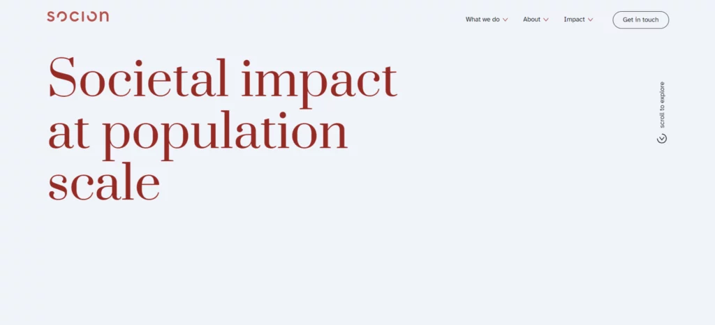
Socion is dedicated to addressing large-scale societal challenges by partnering with development and aid organizations. Their mission emphasizes creating sustainable impact, implementing effective programs with a “first-mile” approach, and leveraging digital platforms for enhanced collaboration. The website’s clean and professional design reflects this purpose with a simple color scheme of white backgrounds, dark text, and subtle accents that ensure content clarity and appeal. The hero section prominently features the statement “Societal impact at population scale,” instantly conveying the organization’s mission, while a “Scroll to explore” prompt encourages deeper engagement. Thoughtfully placed call-to-action buttons like “Get in Touch” and “Learn More” guide users seamlessly, enhancing both visibility and usability. Overall, the site’s intuitive navigation and engaging design effectively mirror Socion’s vision and values.
American Society for the Prevention of Cruelty to Animals (ASPCA)
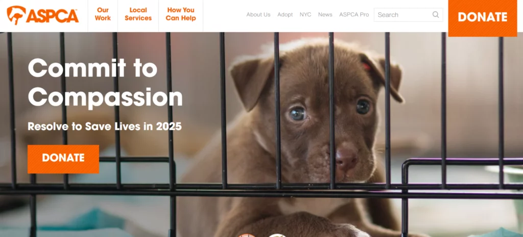
The American Society for the Prevention of Cruelty to Animals (ASPCA) plays a vital role in animal welfare, rescue, and rehabilitation. The website features a simple and user-friendly layout that directs visitors to important sections like Adopt, News, and other essential resources straight from the header. The hero section attracts everyone through captivating writing and heartwarming images of pets. The donate button is placed in the header and other relevant areas of the website for maximum visibility.
Sierra Club
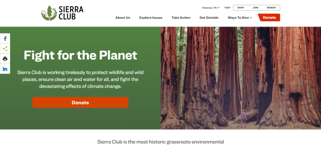
The Sierra Club is a leading environmental organization focused on climate action, preserving wildlife, and supporting sustainable energy policies. The organization engages individuals to protect natural resources through advocacy and grassroots activism. The website features a clean and user-friendly design along with location-based content and donation options and uses a calming nature color combination, and user experience is improved with donation matching and social network integrations.
Best Friends Animal Society
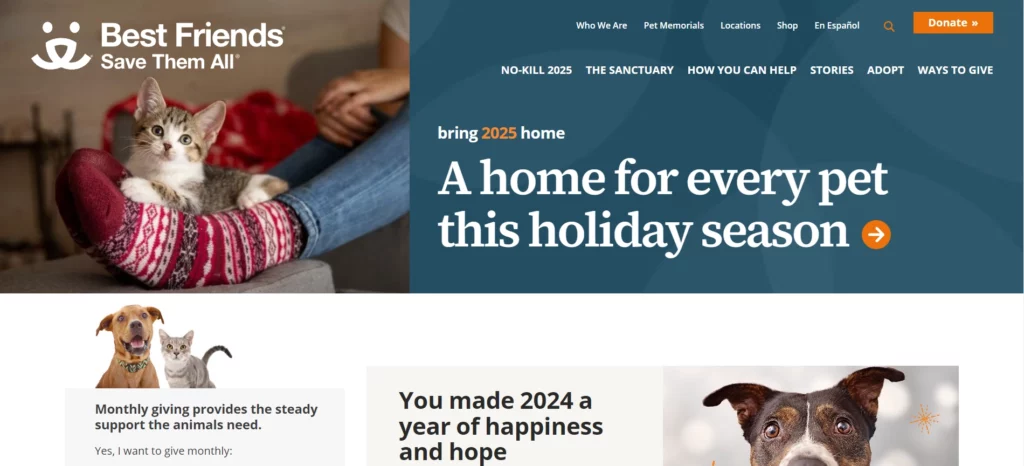
Best Friends Animal Society is committed to promoting animal welfare and inspiring pet adoption through a thoughtfully designed website that engages visitors at every step. With key sections like “Adopt” and “Ways to Donate,” alongside impactful stories and heartwarming images of adoptable animals, the site builds a powerful emotional connection with potential donors and adopters. Prioritizing accessibility, it offers clear navigation, responsive features, and inclusive elements like alt text for images. Strategically placed calls-to-action seamlessly guide users toward supporting the cause, making the platform a heartfelt invitation to make a difference in the lives of animals.
Conservation International Foundation
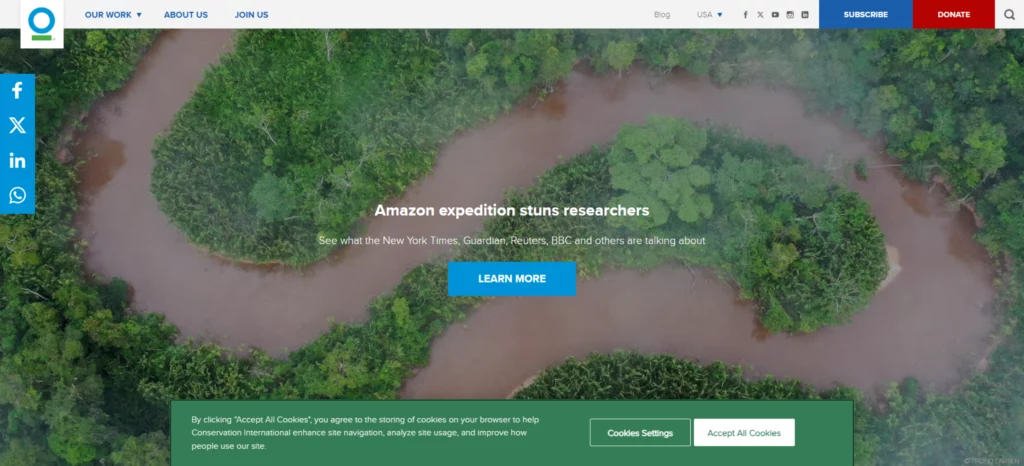
Conservation International is dedicated to the preservation and fostering of sustainable features, and they maintain a well-designed website that motivates environmental action, and the hero section features captivating images and powerful headings along with strong user-engaging calls to action such as Donate and Subscribe and uses carefully chosen color scheme of green, blue, and white for enhanced readability. Accessibility is maintained through highly readable fonts, keyboard-friendly navigation, alt text for images, and enhanced color contrast.
Defenders of Wildlife
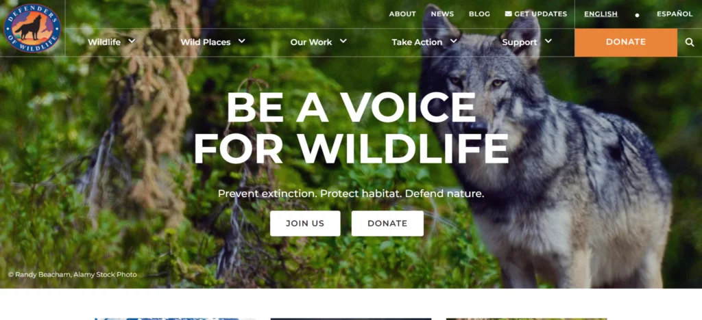
Defenders of Wildlife’s primary objective is to increase awareness about protecting endangered species and their environment. The website design features a clear and well-organized navigation bar with key tabs like Wildlife, Wild Places, and Our Work and dedicated sections for Support, News, and Blog, which help provide information about the organization’s mission. The design keeps the visitors engaged through conservation messages and impactful imagery. Donation form options for monthly and one-time payments, along with strategically placed Donate and Join Us call-to-action buttons for promoting support.
Nashville Zoo
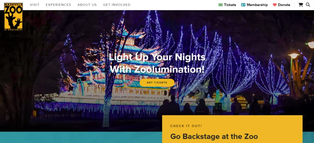
Nashville Zoo supports wildlife conservation and animal care through educational and awareness programs about wildlife preservation. The website design aims to provide a seamless user experience through easy access to needful information, such as donations, membership opportunities, ticket booking, and more. The design features an attractive and user-engaging hero section, which enhances user engagement, a well-placed call to action to promote ticket purchases and donations, and a separate section for keeping the visitors informed about the latest and upcoming events. Overall, the website provides a clear and user-friendly design with a priority on accessibility.
National Audubon Society
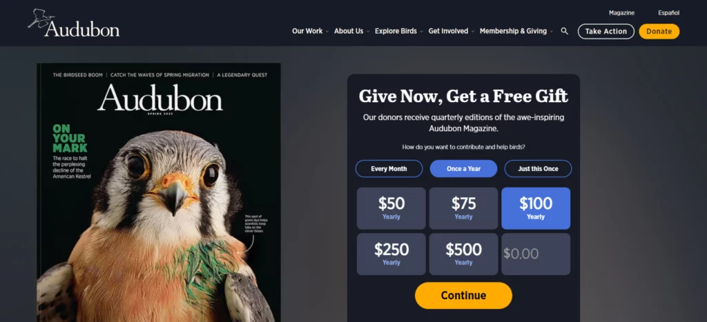
The National Audubon Society aims to protect birds and their environment through campaigning and education. The website features a user-friendly design, providing quick access to details regarding information about organizational objectives, membership, and donations, and follows a natural color schema with easily accessible and vibrant color buttons and a dedicated section for bird exploration, which contributes to user engagement. The hero section provides a handy donation form for one-time or recurring contributions, and call-to-action buttons like Donate and Take Action encourage visitors to contribute and support organizational objectives.
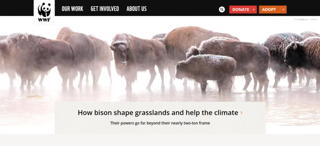
The World Wildlife Fund (WWF)
The World Wildlife Fund (WWF) is committed to preserving biodiversity, preventing climate change, and safeguarding the environment, and the website design follows a user-friendly design approach featuring a clean and well-structured navigation bar that highlights the organization’s initiatives, objectives, and ways to contribute. Additionally, features like an attractive and user-engaging hero section, call-to-action buttons like Donate and Adopt, and a search box make the design more accessible and goal-oriented.
Animal Welfare Institute (AWI)
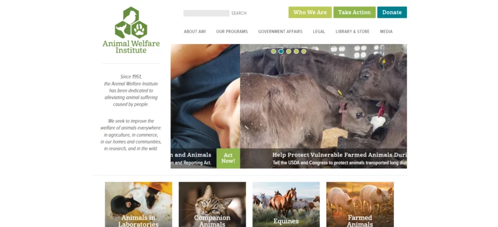
The Animal Welfare Institute (AWI) protects animals from cruelty, preserves natural ecosystems, and improves their living conditions. The design approach is completely connected to their objectives as they follow a simple and user-friendly layout, making it easier for the visitors to navigate through the necessary information. Quickly the hero section attracts users through image sliders with informative texts. Calls to action, such as Who We Are, Take Action, and Donate, are placed in the header for easy accessibility and to make it easier for visitors to contribute to the cause.
Florida State Parks Foundation
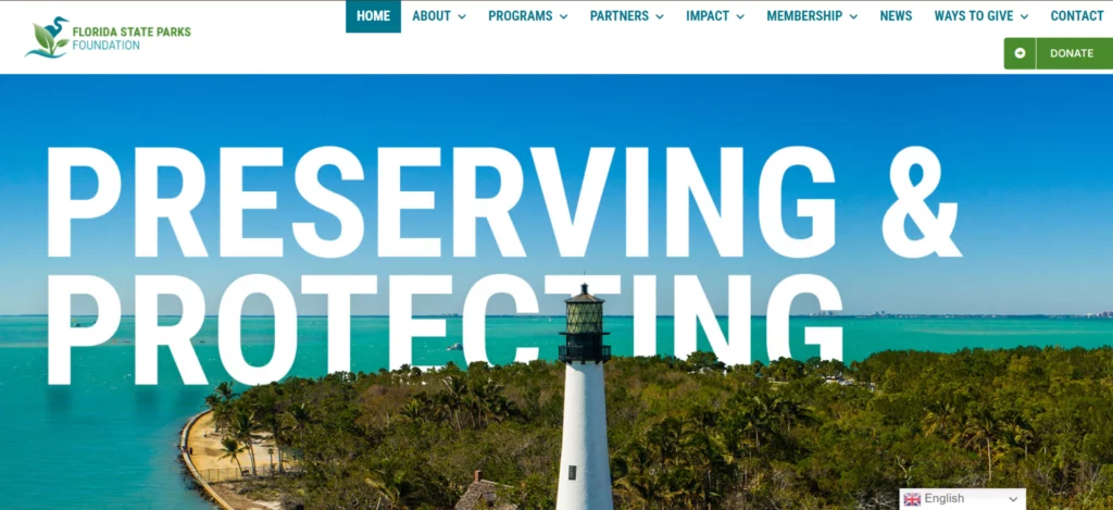
The Florida State Parks Foundation aims to preserve Florida’s state parks for upcoming generations and supports the safeguarding of the park’s cultural and natural resources. The user-friendly design approach helps visitors to easily navigate to important sections: Home, About, Membership, and other important sections, which provide information regarding foundation goals, history, and ways to get involved. The hero section features images of Florida’s natural beauty accompanied by powerful taglines and call-to-action buttons like Become a Member and Donate Now and dedicated sections for displaying the latest news. This improves support and participation. Overall, the website promotes the foundation’s goals and objectives through a highly accessible and user-engaging design.
Wildlife Conservation Society
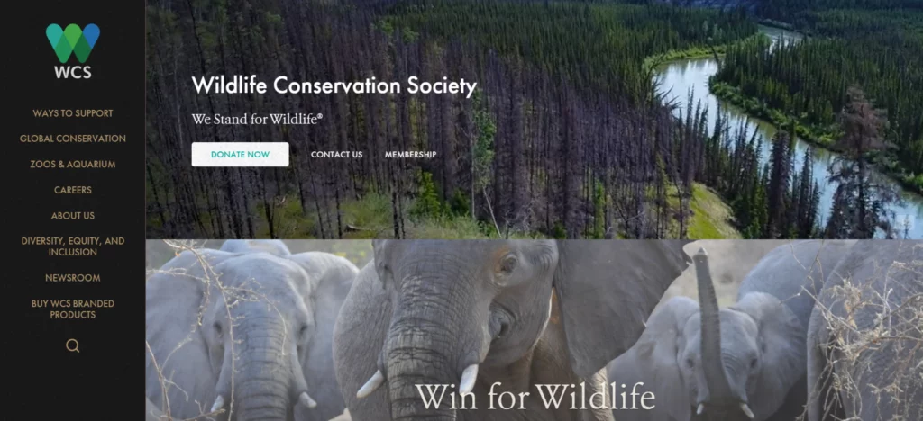
The Wildlife Conservation Society (WCS) preserves wildlife and ecosystems globally through science, education, and advocacy. The website features vibrant videos and images that convey conservation efforts. The design follows a nature-related color combination of earthy blue and green colors and a hero section that engages users with suitable calls to action, and the donation button is easily accessible through a user-friendly navigation bar. Considering all the factors, the website displays Wildlife Conservation Society objectives in an attractive and user-engaging manner.
Community and Economic Development Organizations Websites
Janaagraha
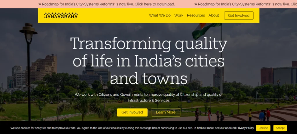
Janaagraha is a non-profit organization dedicated to improving governance and encouraging civic engagement to transform urban India. The design highlights call-to-action buttons with orange and yellow accents followed by white backgrounds for clarity. The full-width hero banner conveys the organizational goals with powerful images and strong taglines. High text contrast, alt text, ARIA labeling, and responsive design are used for maintaining accessibility; overall, the website guarantees a consistent user experience across various devices.
TrustBridge
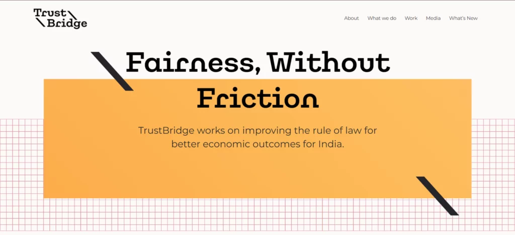
TrustBridge is committed to improving economic outcomes in India by strengthening the rule of law through transparent systems and fair processes. Their website embodies this mission with a clean, professional design featuring a white background, dark text for readability, and strategically placed accent colors to highlight key sections and calls to action. At its core is a compelling hero section showcasing the mission statement, “Fairness Without Friction,” alongside headings like Clear Laws, Transparent Systems, and Fair Processes to emphasize the organization’s focus areas. The design prioritizes accessibility through its high-contrast color combinations, simplicity, and clarity and successfully guides visitors to Trustbridge’s goals, accompanied by an engaging and meaningful user experience.
Murty Trust
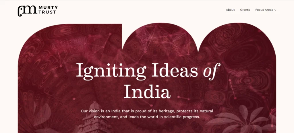
The mission of Murthy Trust is to promote India’s heritage, preserving cultural traditions and environmental sustainability. Its website effectively communicates this mission through a well-structured and engaging design. The color scheme features a cream or off-white background with black text for readability, accented by shades of blue for vibrancy. The navigation bar includes key tabs like” About”, “Grants”, and “Focus Areas”, offering quick access to essential information. The hero section captures attention with compelling taglines and culturally rich imagery, while accessibility is prioritized through high contrast ratios, clear navigation, and Sanskrit phrases. Overall, the website combines elegant design, accessibility features, and cultural elements to create an impactful user experience aligned with the trust’s mission.
Kshetra
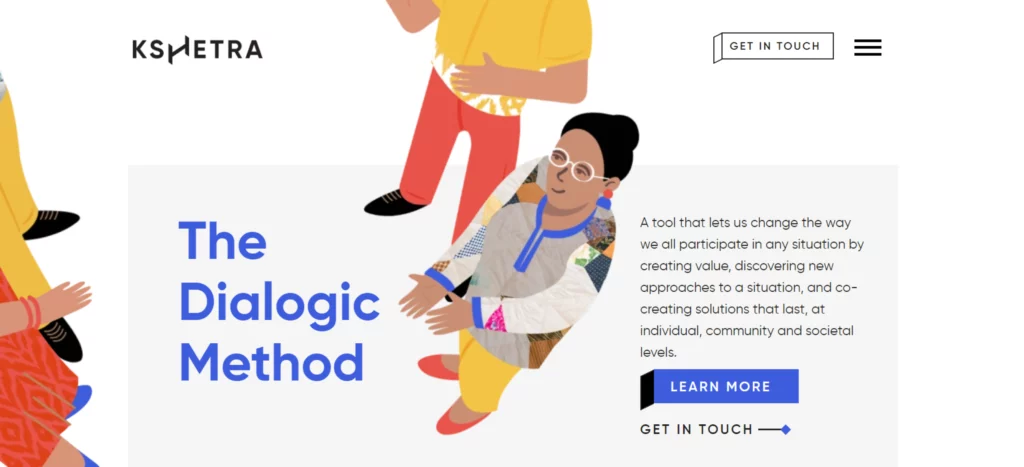
Kshetra is an organization committed to promoting the dialogic method, a tool that promotes new methods, value creation, and co-creation of sustainable solutions at individual, societal, and community levels. The design follows a professional color scheme of whites and grays and deep blues and greens to highlight important aspects. High-quality images and powerful taglines are used for highlighting the hero section and simple menu section, providing quick access to key areas like “who we are”, “what we do”, “the blog”, resources, and call-to-action buttons. Learn more, get in touch, and be placed for instant interaction.
Charity Navigator
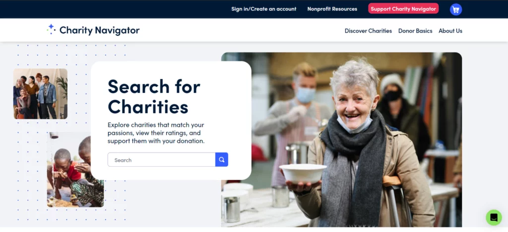
Charity Navigator provides transparent and unbiased ratings, which helps in creating trust between people and organizations, making it simpler for individuals who are willing to contribute to the cause. The website features an easy-to-use interface with a search box for locating organizations and provides a clear and user-friendly layout with meaningful taglines and images. Buttons such as “Support Charity Navigator” are easily accessible, which direct visitors to necessary actions. The charity navigator makes the contribution procedure simpler by providing the necessary information about the organization and making it trustworthy.
Habitat for Humanity
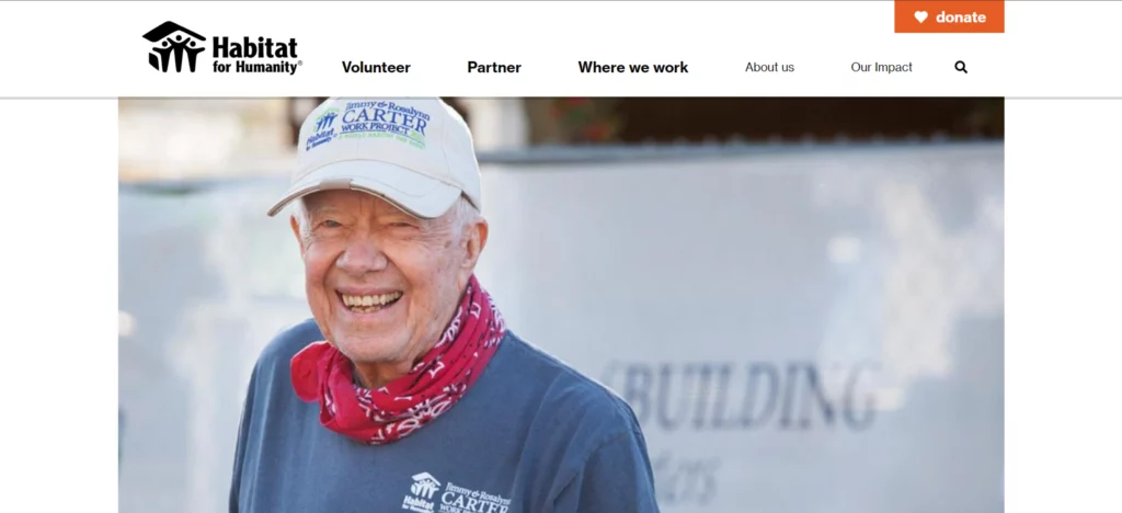
Habitat for Humanity aims to bring communities together to construct and improve houses for needy families. Coming to the design aspects, the header section provides easy access to information such as partnership and volunteer opportunities, and the use of attractive images and powerful taglines instantly attracts visitors to the organization’s mission, while the dedicated sections about news and success stories build an emotional connection and trust with potential contributors, and the thoughtfully placed donation button on the website promotes donation easily.
Kiva
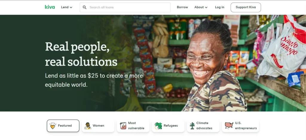
Kiva, a nonprofit organization, empowers communities worldwide by providing financial resources through micro-loans, and its website is thoughtfully designed to reflect this mission. The Lend tab allows visitors to easily explore various loan categories and global locations, while key navigation tabs in the header provide quick access to essential features. The hero section effectively showcases Kiva’s activities, featuring a dedicated donation form for immediate contributions and real-life success stories that highlight the organization’s impact. Strategically placed call-to-action buttons throughout the site enhance visibility and engagement, encouraging visitors to support Kiva’s mission.
Coworker.org
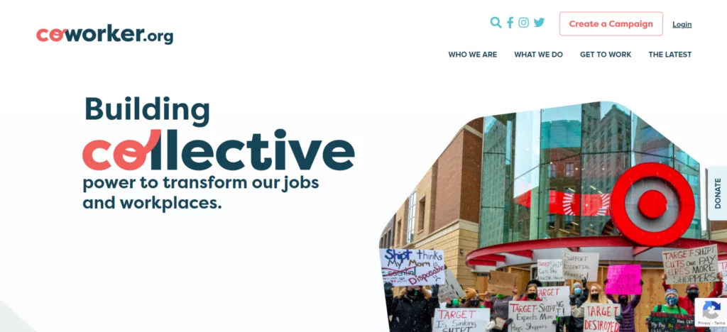
Coworker.org empowers workers by giving them a voice in their workplaces. It enables employees to launch campaigns for improved working conditions and connect with colleagues. The design features a vibrant and engaging color combination of blues, greens, and whites, which creates an engaging user experience. Social media icons are strategically placed in the header for increased engagement and interaction. The hero section grabs attention with compelling taglines and impactful images, while a dedicated form invites users to get involved. Key sections highlight ongoing campaigns and projects, with a prominent “Create a Campaign” button in the header and a fixed contribution button for easy access. Overall, the website is designed to be user-friendly, accessible, and effective in promoting action.
One Acre Fund
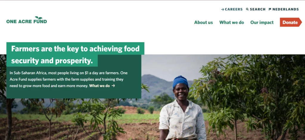
One Acre Fund supports smallholder farmers by offering them vital resources such as financing and agricultural education, providing them with premium seeds and fertilizers. As a result, the farmers become more productive and financially stable. The website uses browns and greens as its primary color combination, as it symbolizes sustainability, growth, and organizational objectives. Visitors are attracted to the header section through captivating taglines and suitable images. Key portions, like One Acre Fund goals, nations they serve, and areas of focus, are highlighted for better engagement, and the call-to-action button for donations is strategically placed in the header itself for better visibility.
Acumen
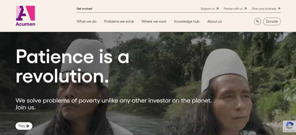
Acumen’s objective is to fight against poverty by addressing healthcare, education, agriculture, and clean energy, and the website design features a vibrant color combination of blue, orange, and green., challenges tackled, locations served, and team details. A fullscreen hero video with compelling taglines instantly engages visitors, while dedicated sections highlight investments and impactful visuals that convey Acumen’s mission. The website guarantees a seamless user experience through search box functionality and prominently placed call-to-action buttons and donation opportunities.
Human Rights Websites
Charity: water
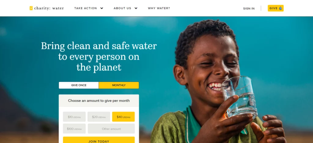
Charity: water’s primary objective is to fund sustainable water projects to address the worldwide water crisis, and the website effectively communicates this mission through a well-optimized design. The design can create a clean user experience through a minimalistic approach and the use of bold images and strong visuals and videos that educate visitors about the value of clean water.. The donation process is seamless, with a form in the hero section and a prominent donate button, encouraging users to contribute effortlessly. The fully responsive website ensures a smooth experience across all devices, while fullscreen images capture attention and convey the mission. Real-time statistics, like the number of funded projects, build trust and transparency, making Charity: water’s site a powerful tool for inspiring action.
Feeding America

Feeding America addresses hunger and food security in the US with a focus on reducing hunger and increasing awareness through long-term community initiatives and activism. The website enhances this mission with powerful visuals, simple navigation, and a fullscreen hero section featuring a donation CTA. Personalized features, such as a zip code search for food assistance, seamless donation processes, and responsive design across devices, make it easy for users to engage and take action, creating an inviting and impactful experience.
Invisible Children
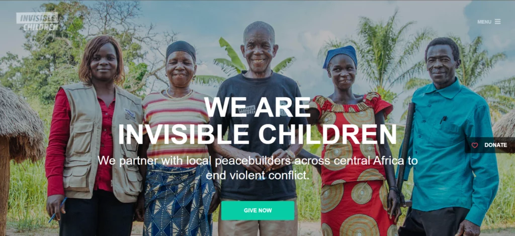
Invisible Children’s website is designed to raise public awareness about the use of child soldiers and promote peace in conflict areas. The home page captures visitors’ attention with a full-screen, attractive hero image. The navigation menu offers clear access to key sections such as “stories”, “challenges”, and “updates”. The color scheme combines dark greys with vibrant reds, oranges, green, and whites for buttons, creating an engaging contrast. Earthy tones add warmth in some sections. User experience is enhanced by the thoughtful placement of call-to-action buttons such as Donate and Learn more with hover effects.
Save the Children

Save the Children’s website delivers a visually compelling and user-friendly experience, combining mission-driven content with strategic design. The red, white, and blue color palette reflects urgency and trust, complemented by a fullscreen hero image with bold call-to-action buttons to engage visitors instantly. A clear navigation bar offers easy access to sections like “Who We Are,” “Ways to Help,” and “Monthly Support,” with a prominent donation button encouraging contributions. News and feature stories highlight updates, while the intuitive layout ensures seamless access to mission-related content and opportunities to support their cause.
Human rights campaign
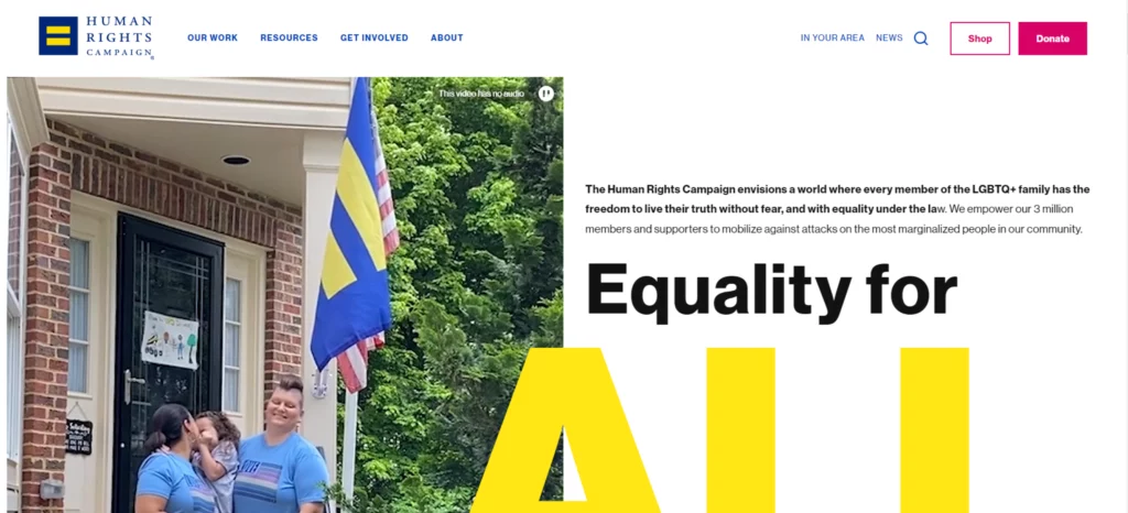
The Human Rights Campaign (HRC) raises its voice for LGBTQ+ equality, ensuring respect, fairness, and dignity for all. It follows a user-friendly design approach containing a well-structured navigation bar with sections like resources, “work”, “news”, “about”, and “get involved”. A captivating hero section with engaging text and videos highlights LGBTQ+ rights and community support. The vibrant color palette of pinks, blues, yellow, and purples reflects LGBTQ+ pride, complemented by strong taglines and high-contrast text for readability. A dedicated news section and impactful visuals create an inclusive and engaging user experience.
Bill & Melinda Gates Foundation
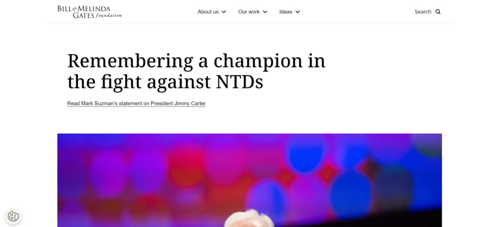
The Bill & Melinda Gates Foundation is dedicated to eradicating poverty, creating educational opportunities, improving healthcare globally, and improving the living conditions of people who are from developing or underdeveloped nations. The predominant use of blue and darker tones, combined with a white background, ensures excellent readability. A full-length hero video engages visitors emotionally, building a strong connection to the Foundation’s work. The hero section features large, bold text, making key messages stand out, and prominent call-to-action buttons guide users to take the next step. The website also includes sections that highlight trending topics and Foundation facts, further building trust and credibility. The use of a grid layout in the design makes it easier for users to locate the information they need and arrange the content in an organized manner. Overall, the website design conveys the organizational mission by prioritizing accessibility.
UN Human Rights Council
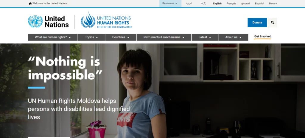
The Office of the United Nations High Commissioner for Human Rights (OHCHR) is dedicated to the promotion and protection of human rights globally, and its objectives are reflected in its website design, which uses a simple design approach with a color combination of blue and white for improved clarity and readability. The dynamic header offers direct links to key areas, such as “human rights resources” and “current initiatives”. A dedicated news section keeps users informed of the latest updates and key human rights developments. Clear calls to action, placed strategically throughout, encourage visitor engagement and interactions. These elements come together to ensure an intuitive user experience while advancing OHCHR’s critical goals of promoting global human rights.
Youth Programs, Child Development, and Education Websites
Room to Read
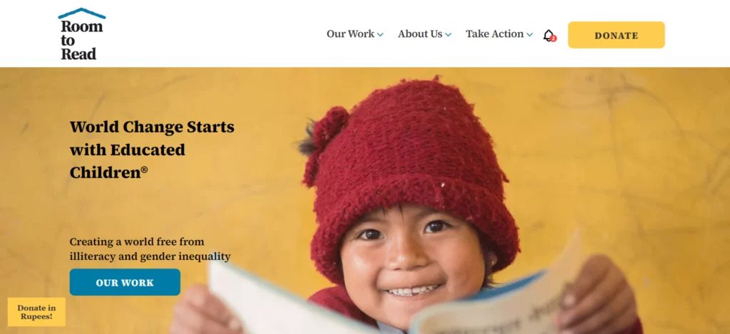
Room to Read is dedicated to improving literacy and advancing gender equality by providing educational opportunities for children, especially in underserved communities. Their efforts focus on building schools, creating libraries, and supporting girls’ education through mentorship programs. The website effectively reflects this mission with an intuitive, user-friendly design, featuring sections such as “Work,” “About Us,” and “Take Action,” along with a prominent “Donate” button to encourage engagement. A full-screen hero image and impactful taglines emphasize the importance of literacy and education. The site features minimal text and full-length images to create a strong emotional connection with visitors. It uses a vibrant color combination of blue, orange, and green, along with high-quality visuals and real-life stories that result in the organization’s impact. Call-to-action buttons like “Donate Now” and “Get Involved” are perfectly placed to encourage engagement. Overall, the responsive and accessible design creates a smooth browsing experience for all users.
UNICEF
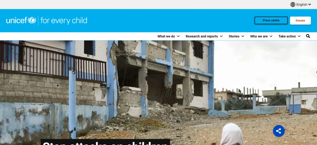
UNICEF is one of the most popular global organizations that focuses on safeguarding children’s rights and welfare and guarantees that all children have access to basic needs such as clean water, health care, education, and protection from violence. They approach a goal-oriented website design featuring a user-friendly navigation bar that points out the important information users are drawn into an attractive hero section with captivating images, and the prominently placed donation buttons ensure the support. The site’s responsive layout, keyboard navigation, and organized headings create a seamless user experience for all users.
LiftEd
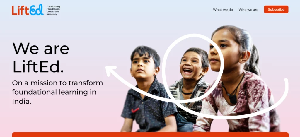
LiftEd focuses on improving educational outcomes for young learners and ensuring that every student gets a strong start in their education. The website follows a simple and attractive, goal-oriented design with a color scheme of white, gentle blues, and green as it promotes trust and growth. The hero section draws attention with strategically placed call-to-action buttons along with objective-oriented taglines and engaging images of children. The use of a single-column layout, clear text, and high-quality images guarantees user experience, and accessibility is maintained through features like alt text and keyboard navigation, making it accessible for all users. Overall, the website follows a user-centric design approach.
Boys & Girls Clubs of St. Lucie County
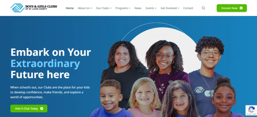
The Boys & Girls Clubs of St. Lucie County empowers and inspires young people to realize their full potential through educational, recreational, and mentorship programs. The website features a vibrant design with blue and green colors, as they convey trust and positivity, along with bright buttons for improved readability and interaction. Users can access important information easily and quickly through the well-organized navigation bar, which offers easy access to sections such as “Home”,” About Us”, “Programs”, “Events”, “News”, “Get Involved”, and “Contact”. The hero section captivates visitors with impactful imagery of children along with catchy taglines and thoughtfully placed call-to-action buttons. Overall, the design offers a user-friendly experience that effectively communicates the organization’s values.
Children International
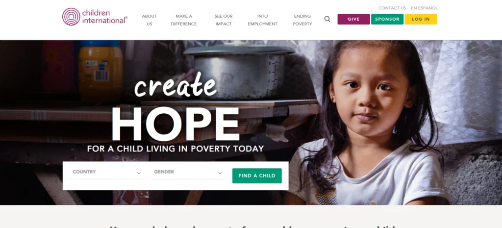
Children International works to end the cycle of poverty for children and youth by giving them access to health care, education, and life skills that empower them to a brighter future, and their mission is reflected in their website as they prioritize a user-friendly approach that provides easy access to important tabs that provide details about organization goals and opportunities. The banner section features a full-length hero image that emotionally connects with visitors, and the header section consists of well-positioned call-to-action buttons, making it easier to support the cause. Reading and engagement are improved through simple navigation and distinct titles. The design emphasizes storytelling through impactful images and narratives, showcasing the impact of their programs on individuals and communities.
Children’s Defense fund
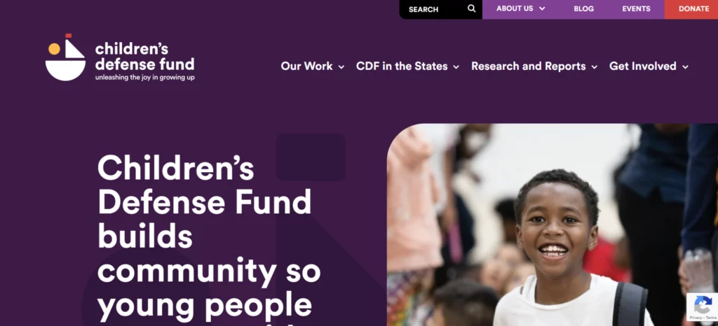
The Children’s Defense Fund (CDF) is dedicated to ensuring a bright future for all children, especially those who are subjected to poverty, limited access to basic resources, or discrimination. Their website features a clean and professional design that features colors like white for backgrounds along with blue and orange colors that convey trust, perfectly suited to their objectives. The hero section includes images of kids and communities combined with catchy taglines that express CDF’s objectives and provide easy access to information regarding programs, events, and blogs through a simple navigation menu. Contributions are simplified with easily accessible donation buttons. The design maintains strong accessibility through features like well-structured design, distinct headings, and improved readability.
Teach For America
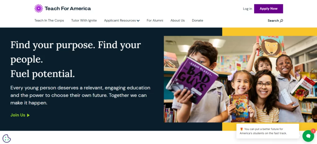
Teach For America (TFA) aims to reduce educational inequality in the United States by increasing educational opportunities for students in low-income communities. The website is designed to engage visitors with a user-friendly layout that offers quick access to key details about the organization and donation opportunities, and the hero section attracts visitors with impactful taglines, eye-catching images, and suitably placed calls to action, along with real testimonials that build trust among donors. Engagement is further improved through dynamic social media feeds. Overall, the website is well structured with effective call-to-action buttons with prioritized accessibility.
Environmental Youth Alliance
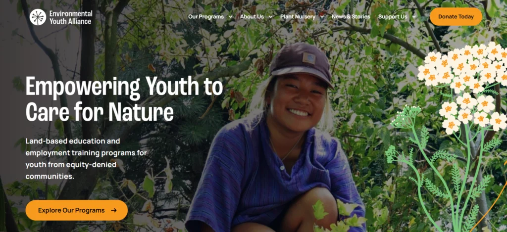
The Environmental Youth Alliance (EYA) supports the empowerment of young people to become environmental leaders, and the design uses a nature-inspired color combination of green and brown as it focuses on sustainability and the important roles to be played by youth in environmental change because of the user-friendly nature of visitors being able to locate recent information about organization activities, educational resources, and community programs. The website is made accessible to all users through high-contrast text and simple fonts, and the dedicated sections on news and stories regularly update about EYA’s activities, and the call-to-action buttons encourage participation and donations.
Religious Organizations Websites
Catholic relief services
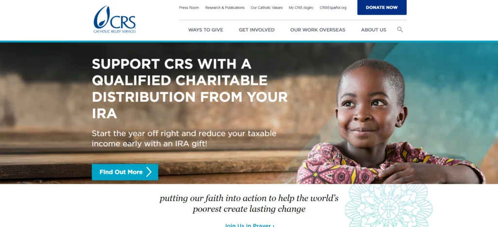
Catholic Relief Services (CRS) is dedicated to reducing suffering, promoting human development, and upholding individual dignity. Key sections such as “Our Work”. “Get involved”, ‘News”, and “Ways to Give” are categorized under an easy-to-use navigation bar. making it easier for users to access information. The design follows a warm and earthy color combination, while the hero section attracts and encourages participation through strong visuals and call-to-action elements to encourage participation. Accessibility is maintained through responsive design, alt text, and keyboard navigation, making it easier for visitors to contribute and stay informed about CRSs.
Compassion International
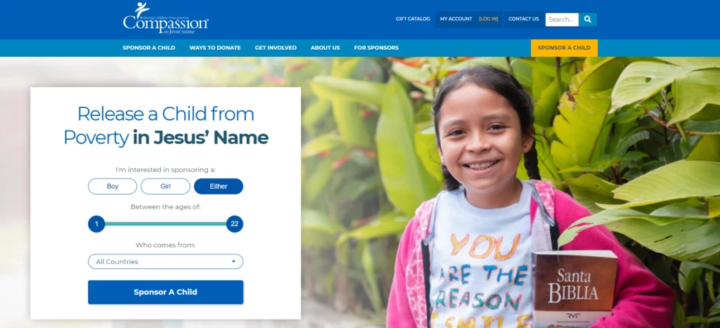
Compassion International aims to lift children out of poverty by providing them with educational and medical support, and the website features a blue and gray color combination in a user-friendly layout. The use of a full-length hero image can create a strong emotional connection and showcase the importance of child sponsorship. Additionally, the navigation bar offers quick access to key information. In the hero section, an engaging form and taglines encourage visitors to sponsor a child, creating a personal experience. The site also offers multiple ways to contribute through accessible donation and sponsorship forms, all presented in a responsive design that ensures usability on any device, making it simple for users to get involved and support the cause.
Wonder ink
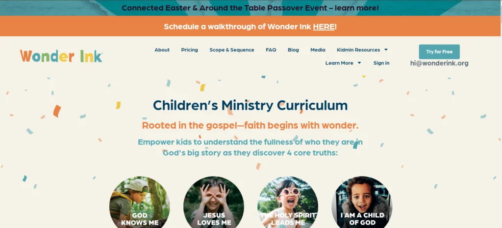
Wonder Ink empowers poor or marginalized children by encouraging education and artistic expression. The website follows a child-centric design approach through attractive scrolling animations. Important information is placed in a colorful and easy-to-access navigation bar, and visitors can easily acquire the full curriculum sample through dedicated form submissions. Overall, the site stands out with its distinctive layout, well-placed calls to action, and powerful testimonials.
American Jewish World Service (AJWS)
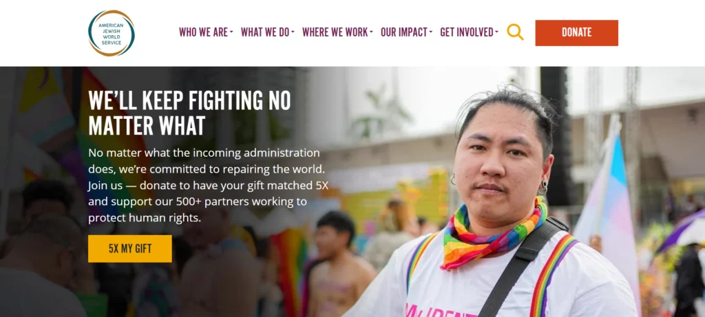
American Jewish World Service (AJWS) assists marginalized communities and promotes human rights and development worldwide. The design prioritizes accessibility and user engagement through striking color schemes and easy-to-use navigation. The hero section captures attention through powerful visuals, and sections like country-specific projects and annual reports highlight the organization’s global impact. Additionally, the thoughtfully placed donation buttons and social media icons improve engagement.
Conclusion
Your nonprofit website is more than just an online presence; it acts as a hub and center of attraction for your organization’s activities. This article showcases some of the best nonprofit websites, demonstrating how thoughtful design can inspire and leave a lasting impression on visitors.
By partnering with expert nonprofit website design services, you can transform your vision into a powerful digital platform that inspires visitors to support your cause.
Now it’s the perfect moment to transform your nonprofit digital strategy. Let these examples inspire you and set you up for success in 2025 and beyond!
FAQ
What is the best website for a nonprofit organization?

A well-designed nonprofit website should share its mission and connect with visitors. Key features include:
- User-friendly layout for easy navigation
- Mobile-responsive design for accessibility across all devices
- Concise messaging to communicate the organization’s mission and goals
- Donation options to encourage financial support
- Event management tools to promote activities and programs
- Volunteer sign-up features to encourage community involvement
- An “About” section highlighting the organization’s impact and objectives
What is the ideal domain for a nonprofit organization?
The .org is the ideal domain for nonprofits. It is widely recognized and trusted by donors, supporters, and the community. Using a .org domain helps establish credibility and reinforces the nonprofit’s mission.
Is WordPress good for nonprofits?
Yes, WordPress is an excellent platform for nonprofit organizations. It is an affordable, user-friendly solution that allows nonprofits to create professional websites without a significant initial investment. WordPress provides themes and plugins for nonprofits, including event tools, donation forms, and email integration, making it a great choice for expanding reach and impact.
What is a website for a nonprofit?
A nonprofit website shares the mission, connects with supporters, and highlights its impact. It typically includes features such as:
- Volunteer opportunities
- Donation options
- Event announcements
- Success stories
A well-structured nonprofit website helps build credibility, raise awareness, and foster community support.
Leave a Reply
Articles
Related Insights.
Blogs and Resources on WordPress, WooCommerce, SEO and Marketing
Leave a
Comment.