Icon
Contents
Post Grid Layouts
Post Filter
- Hide Main Title Selection
- Hide Link
- Link Title
- Post Type Selection
- Taxonomy Selection
- Multiple Term Selection
- Background Color
- Choose Background Image
- Padding & Margin
- Heading Settings
- Excerpt Settings
- Author & Date Settings
- Active Term Styling
- Regular Term Styling
- Post Styling
- Hover Effect
- Actions
- Advanced
Post Ticker
Slider
URL Snippet
Parallax
Midnay Patterns
The Icon Block allows you to add and customize icons easily within your content. Icons can be selected from built-in libraries such as Favicon and Dashicons, or uploaded directly from the Media Library for more personalized visuals. Users can fully customize the icons with a wide range of styling options, including size, color, background, padding, margin, border, hover effects, and alignment.
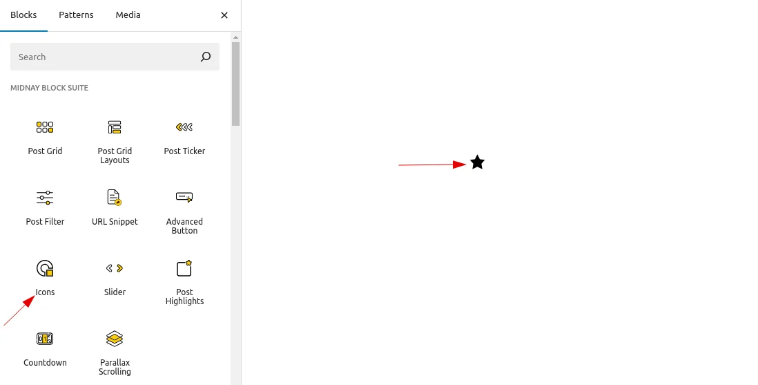
Add Icon block on edit page
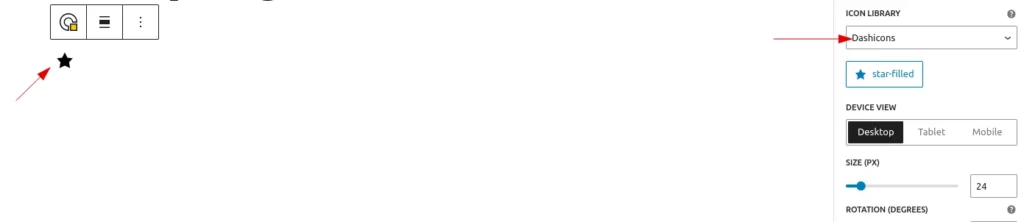
- By default, the icon is a star (from Dashicons).
Icon Settings
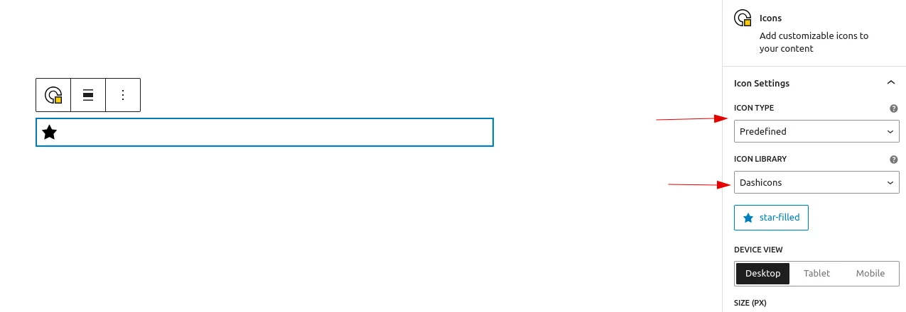
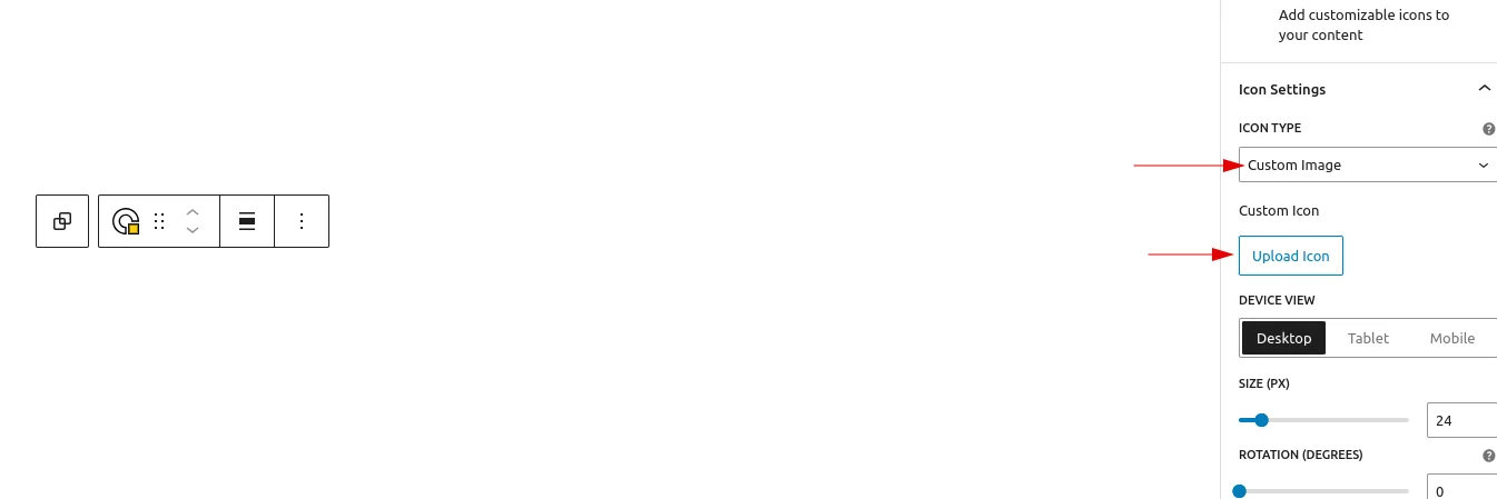
- Icon Type
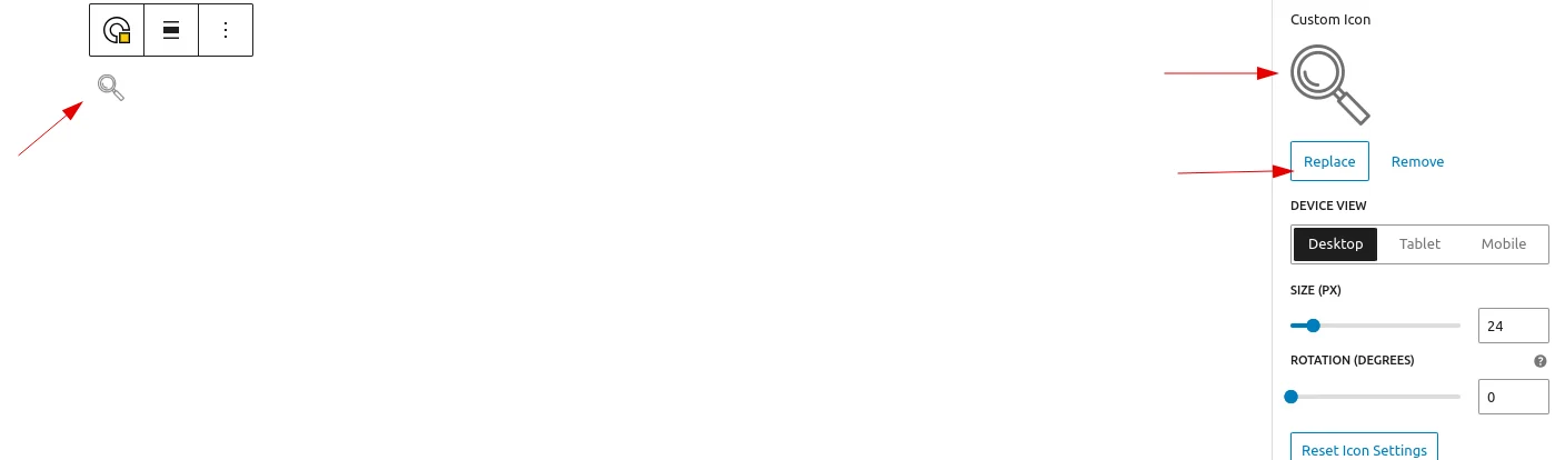
Users can choose between predefined icons and custom images. If a predefined option is selected, icons can be chosen from the built-in libraries (Favicons and Dashicons). If a custom image is selected, users can upload an icon or select one from the Media Library, with the ability to replace or remove it as needed.
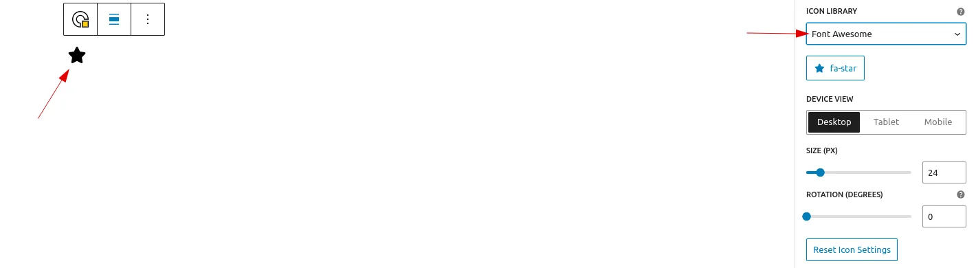
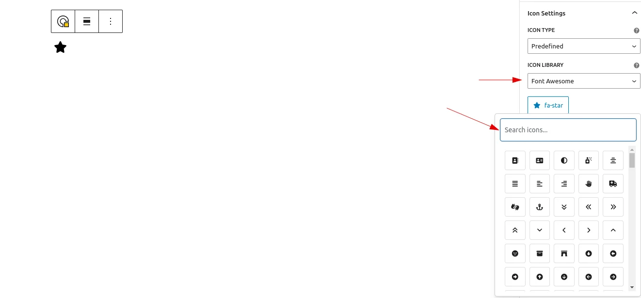
- Icon Library
If the icon library is selected, users can choose either Favicons or Dashicons (with Dashicons selected by default). A button is provided to open the icon library, allowing users to browse and select an icon from the chosen set.
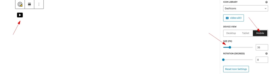
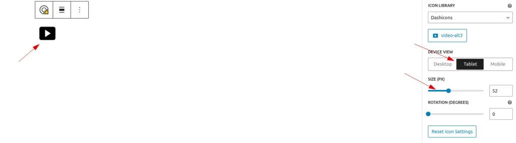
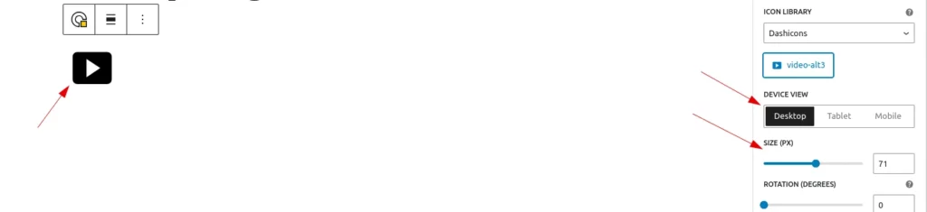
- Icon Size
Users can adjust the icon size as needed (the default size is 24).and can set different size for mobile tab and desk
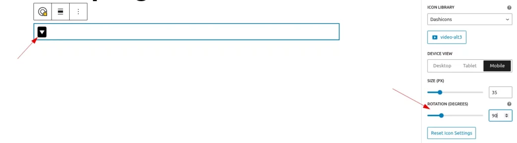
- Icon Rotate
Users can rotate the icon to any angle as needed.
Style Settings
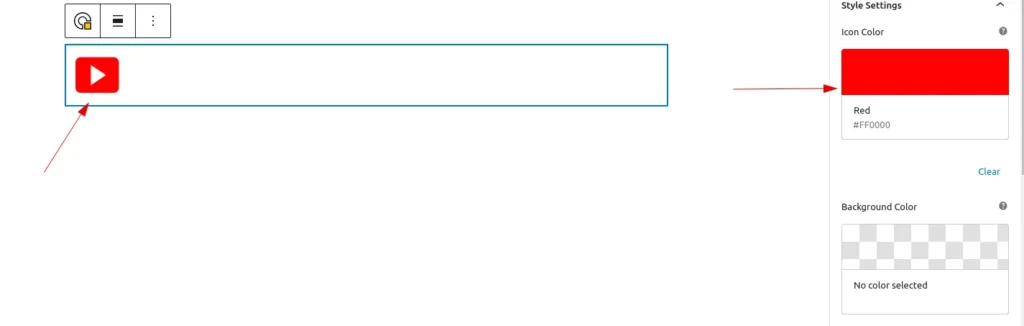
- Icon Color
Users can set a color for the selected icon. However, if the selected type is a custom image, the color option is not available.
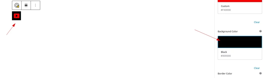
- Background Color
Users can apply background color to the icon.
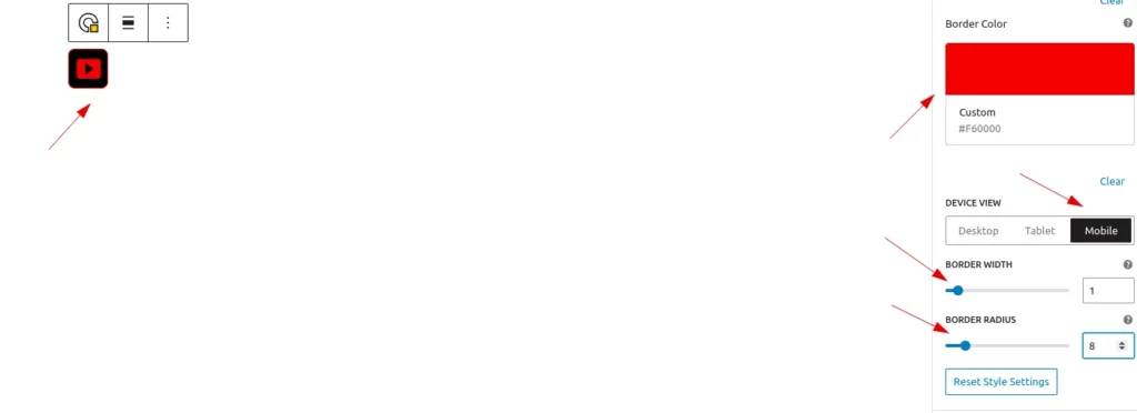
- Border Styles
Users can add a border to the icon’s background and also apply a border radius for rounded corners.and can set different border width and radius for mobile tab and desk
Spacing Settings
- Padding
Users can add padding around the icon and set individual values for top, right, bottom, and left padding separately.can set different padding for mobile tab and desk
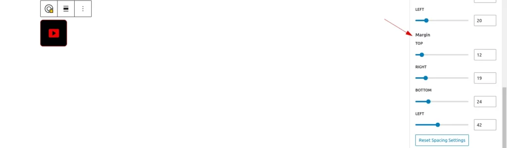
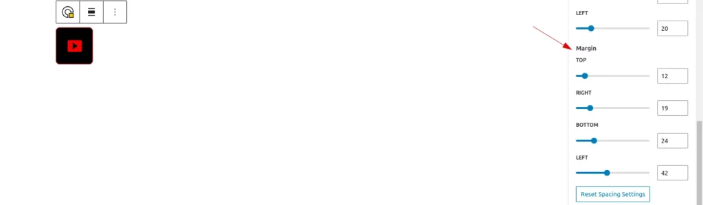
- Margin
Users can add margin around the icon and set individual values for top, right, bottom, and left margin separately.can set different margin for mobile tab and desk
Hover Settings
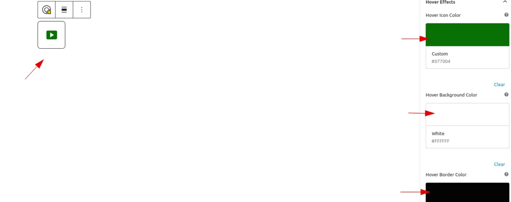
- Hover Colors
Users can set Hover colors for background,icon and border.
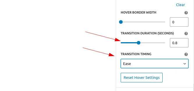
- Hover Transitions
Users can set transition duration and timing
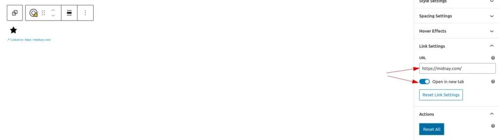
Link Settings
Users can add a link to the icon and choose whether it opens in a new tab or not.
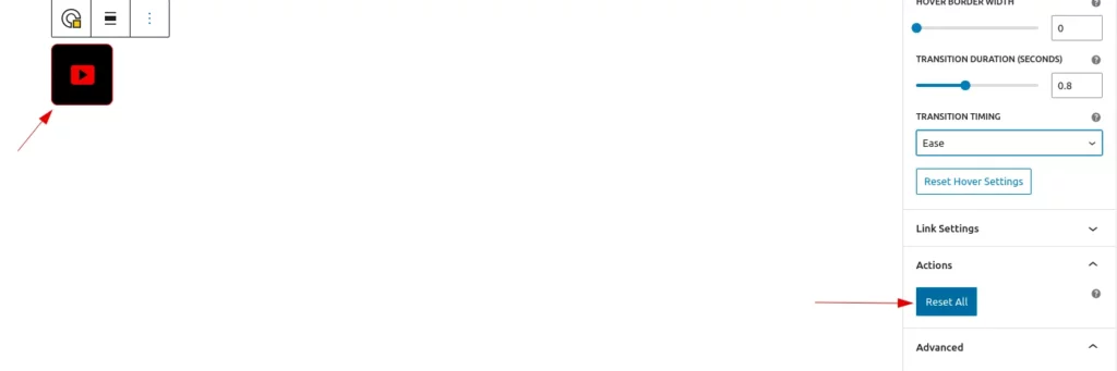
Actions
Users can reset all the link settings by clicking reset button