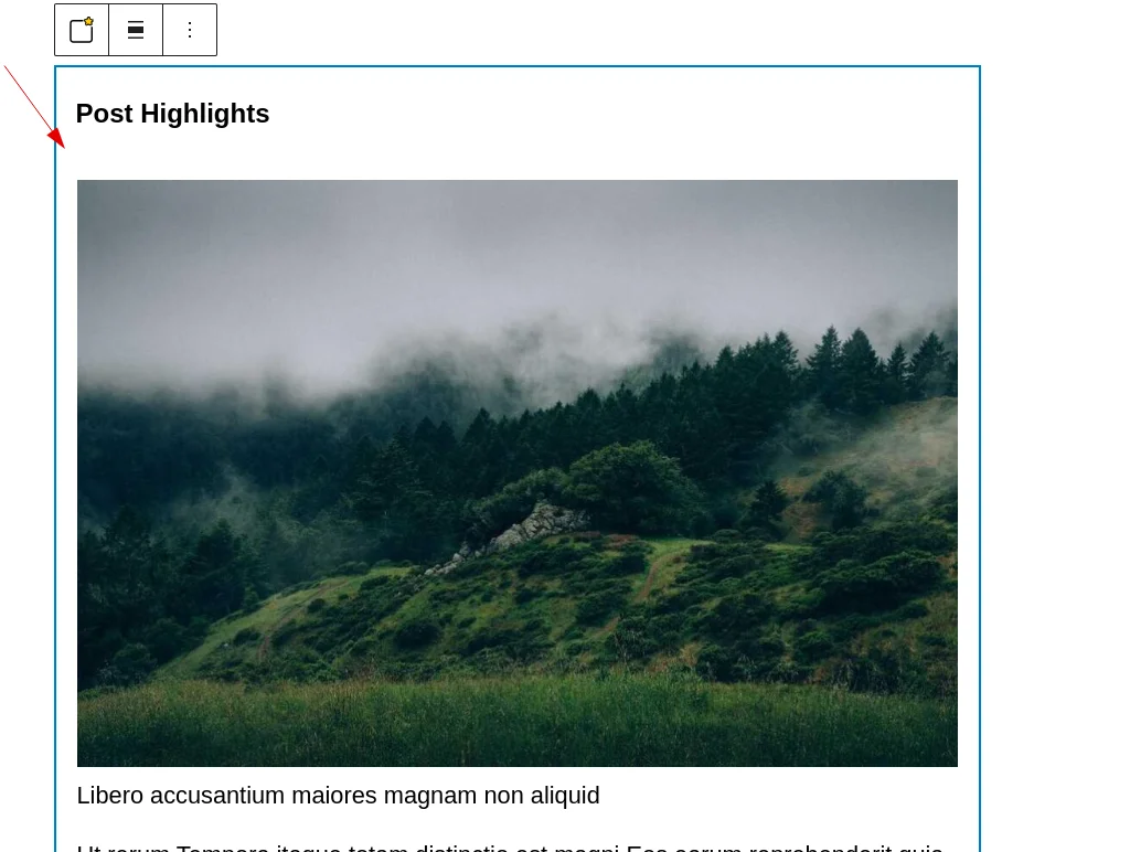
Post Highlights
Contents
Post Grid Layouts
Post Filter
- Hide Main Title Selection
- Hide Link
- Link Title
- Post Type Selection
- Taxonomy Selection
- Multiple Term Selection
- Background Color
- Choose Background Image
- Padding & Margin
- Heading Settings
- Excerpt Settings
- Author & Date Settings
- Active Term Styling
- Regular Term Styling
- Post Styling
- Hover Effect
- Actions
- Advanced
Post Ticker
Slider
URL Snippet
Parallax
Midnay Patterns
The Post Highlights block is a versatile WordPress Gutenberg component designed to showcase selected posts with extensive customization options. Users can filter and display posts from any post type while controlling layout, styling, and content display settings through an intuitive interface. The block offers comprehensive customization including typography, colors, borders, and image handling, all while maintaining responsive design principles. User can create more layouts by clubbing with this block.
Step 1:
Add Post Highlights block on edit page.
Step 2:
By default, the one latest post on the website is displayed.
This block includes different style settings:
Step 3:
Title Settings
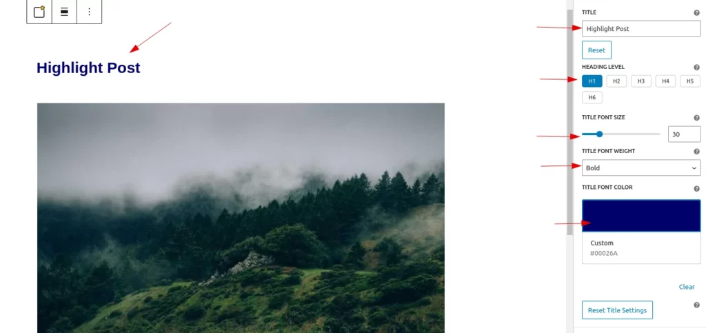
Title
In this feature, the user can easily customize the block’s title name. By default, the title is set to ‘Post Highlights’. Additionally, a reset button is provided, allowing the user to reset the title to its default state.
Title Font Size
In this feature, the user can easily customize the font size of the block’s title. By default, the font size is set to 30px. The user can adjust the size within a range, with a minimum value of 10px and a maximum value of 100px.
Title Font Weight
In this feature, the user can easily customize the font weight of the title. By default, the font weight is set to ‘Bold’. The user can choose from three options: ‘Normal’, ‘Bold’, and ‘Lighter’.
Title Font Color
In this feature, the user can easily customize the title’s font color. By default, the font color is set to black. Additionally, a clear button is included, enabling the user to reset the font color to its default state.
Reset Title Settings
This button resets all title settings to their default state.
Step 4:
Post Settings
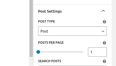
Post Type Selection
Users can change the post type using the selection dropdown, which displays “Posts” as the default option along with other available custom post types.
Post Per Page
The user can set the number of posts to display on the screen. By default, it is set to 1.
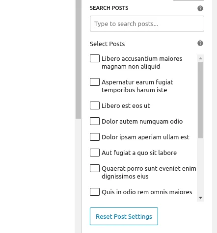
Search Post And Select Posts
Users can search and select which posts to display on the screen by using the checklist.
Step 5:
Style Settings
Background Color
This feature allows users to easily set the background color of a block. By default, the background is transparent. A “Clear” button is also provided to reset it to the default color.
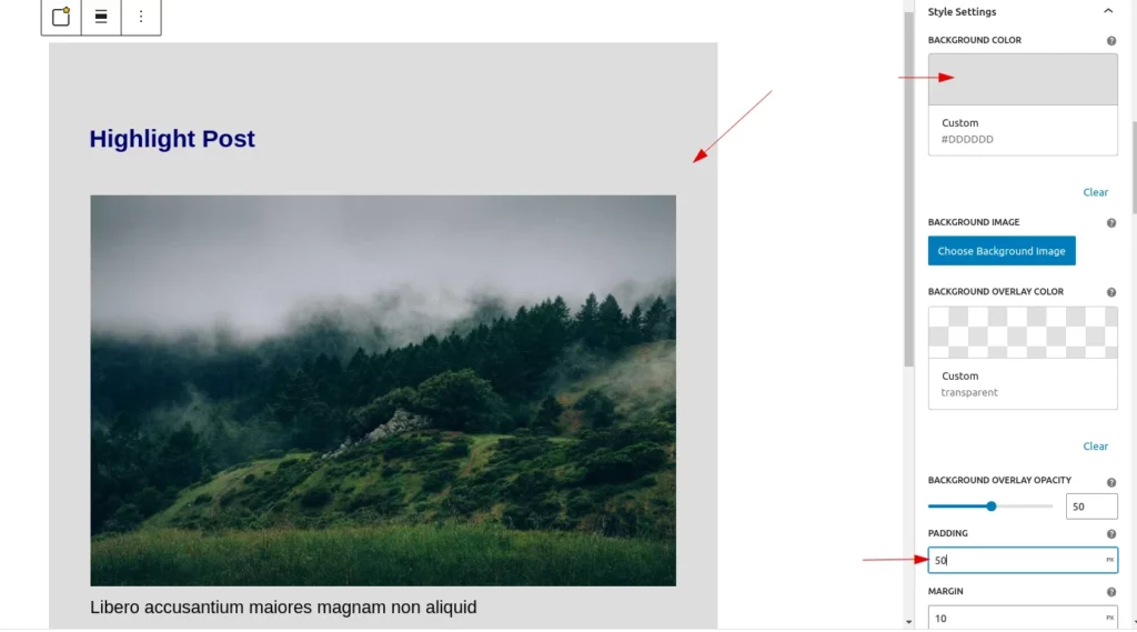
Choose Background Image
The user can easily set an image as the background of a block. A clear button is available to remove the selected image, and they can also add a background overlay color to the image.
Background Overlay opacity: Users can adjust the background overlay opacity for better customization.
Padding & Margin
The user can easily adjust the margin and padding values, with both set to 10px by default. They can customize these values as needed using units such as px, rem, em, %, vh, and vw. A reset button is also available to restore the values to their default state.
Heading Settings
The user can easily customize the post heading.
Hide Post Heading: A toggle button allows the user to hide the post heading. They can easily enable or disable it as needed. When the toggle is enabled, all heading customization options will also be hidden.
Font Family: The user can add their preferred font family, with the default set to Arial, sans-serif.
Heading Font Size: The user can customize the font size of the post heading, ranging from a minimum of 10px to a maximum of 100px, with a default size of 24px.
Heading Font Weight: The user can adjust the font weight of the post heading to normal, bold, or lighter, with bold as the default setting.
Heading Font Color: The user can customize the heading color, with the default set to black.Additionally a clear button along with it, which resets to default state.
Excerpt Settings
The user can easily customize the post excerpt.
Hide Post Excerpt: A toggle button allows the user to hide the post excerpt. They can easily enable or disable it as needed. When the toggle is enabled, all excerpt customization options will also be hidden.
Excerpt Lines: The user can set the number of lines to display in the excerpt.
Content Font Size: The user can customize the font size of the post excerpt, ranging from a minimum of 10px to a maximum of 100px, with a default size of 16px.
Content Font Weight: The user can adjust the font weight of the post excerpt to normal, bold, or lighter, with normal as the default setting.
Content Font Color: The user can customize the content color, with the default set to black.Additionally a clear button along with it, which resets to default state.
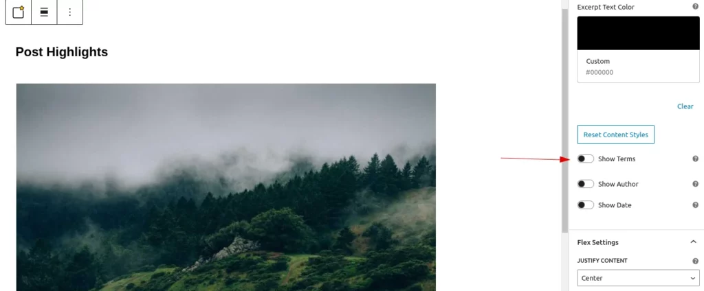
Show Terms Toggle
Enabling this toggle will display the term names of the posts, along with any customizations of the terms.
Term Font Size, Term Font Color & Term Font Weight
Term font size:Users can easily customize the font size of the selected terms. By default, the font size is set to 16px. The size can range from a minimum of 10px to a maximum of 100px.
Term font color:Users can easily customize the color of the link. By default, the color is black.
Term Font Weight: Users can easily customize the font weight to “Normal,” “Bold,” or “Lighter.” By default, it is set to “Normal.”
Author & Date Settings
There are two toggle options for displaying the author’s name and the post date. When enabled, the author name and date will be displayed, along with their customization options. By default, both toggles are set to false.
Author and Date Font Size: The user can customize the font size, ranging from a minimum of 10px to a maximum of 100px, with a default size of 16px.
Author and Date Font Weight: The user can adjust the font weight to normal, bold, or lighter, with normal as the default setting.
Author and Date Font Color: The user can customize the color, with the default set to black. Additionally, a clear button is available to reset the settings to their default state.
Step 6:
4.Flex Settings
Flex Settings allow users to set flex property values for the block.
- Justify Content
Used to align and distribute the space between flex items along the main axis.
It had properties:- start : Align the flex items at the start of the container along the main axis.
- center:Centers the flex items along the main axis.
- End: Aligns the flex items at the end of the container along the main axis.
- space-between: Distributes the items with equal space between them, leaving no space at the start or end.
- space-around: Distributes the items with equal space around them, with half of the space on either side of the items.
- Flex Direction
This property defines the direction in which flex container’s children are placed in the flex container- row (default): The flex container’s main axis is horizontal. The children are placed in a row, from left to right.
- column: The flex container’s main axis is vertical. The children are placed in a column, from top to bottom.
- Flex Wrap
flex-wrap property in CSS controls whether the flex container’s children are forced into a single line or can be wrapped onto multiple lines.- nowrap : All flex items will be on a single line.
- wrap: Flex items will wrap onto multiple lines, from top to bottom.
- Align Items
The align-items property in CSS is used to align flex container’s children along the cross axis.- start: The flex items are aligned at the start of the container.
- flex-end: The flex items are aligned at the end of the container.
- center: The flex items are centered in the container.
- baseline: The flex items are aligned such that their baselines align.
- Gap
The gap property in CSS is used to define the spacing between items in a grid or flex container. Users can customize the value in pixels (px). By default, the gap is set to 25px.- Column gap
Users have the ability to customize the spacing between columns. - Row gap
Users have the ability to customize the spacing between rows.
- Column gap
Note: If the user sets a column/row gap, the default gap will be reset. Users can also set the column and row gaps separately if needed. The default gap will apply to both column and row gaps if not specified.
Reset Flex Settings
This button resets all flex settings to their default state.
Step 7:
Post Settings
The Post Styles panel allows you to customize the appearance of individual post containers within your Post Highlights block. Here are the available options:
Background Settings
Background Color: Choose a custom background color for post containers using the color palette
Background Image: Add a decorative background image to post containers
Use “Select Background Image” to upload or choose an image
“Remove Image” button appears when an image is selected
Background Overlay Color: Add a colored overlay on top of the background
Background Overlay Opacity: Adjust the transparency of the overlay (0-100%)
Border Settings
Border Width: Set the thickness of the border (0-10px)
Border Color: Choose a custom border color using the color palette
Border Radius: Round the corners of post containers (0-50px)
Spacing Settings
Padding: Set internal spacing between post content and container edges
Supports various units (px, em, rem, etc.)
Quick reset to “0px” available
Margin: Set external spacing around post containers
Supports various units (px, em, rem, etc.)
Quick reset to “0px” available
Reset Post Settings
This button resets all post settings to their default state.
Step 8:
Image Settings
This setting allows users to customize the featured images on the post types.
- Hide Featured Image
Users can hide the featured image based on their needs. When the image is hidden, the associated styles for the image at the bottom will also be hidden.
- Aspect Ratio
User can choose from preset aspect ratios or create your own:
3:2 (Landscape) – Standard landscape format
16:9 (Widescreen) – Modern widescreen format
4:3 (Standard) – Traditional photo format
1:1 (Square) – Perfect square format
2:3 (Portrait) – Vertical portrait format
Custom – Define your own ratio (e.g., “16/9”)
- Featured Image Height
Users can customize the height of the featured images in percentage, pixels and also in rem values. By default, it is set to 17.053rem, but users can adjust it as needed .
- Featured Image Width
Users can customize the width of the featured images in percentage, pixels and also in rem values. By default, it takes 100%, but users can adjust it as needed.
- Border radius
Users can add a border radius to the featured images. By default, it is set to 5px, but users can customize it using percentage, pixels, or rem values.
- Hover Effects
Users can add hover effects to images and customize their properties.default value is grayscale. The available options and functionality include:
- Hover Effects:
- Grayscale: Adjust the intensity (default value is 1 for maximum grayscale). Decrease the value to reduce the grayscale effect.
- Scale: Adjust the scaling factor to increase or decrease the image size.
- Rotate: Apply a slight rotation (default value is 1). Decrease the value to reduce the rotation effect.
- Opacity: Control transparency (default value is 1 for full opacity). Decrease the value to reduce opacity.
- Effect Value:
- Use the range control to adjust the effect intensity for the selected hover style.
- The range control is only displayed when a hover style is selected.
- Transition Customization:
- Set the transition duration to control the smoothness of the hover effect.The default transition value is 0.3.
Reset Image Settings
This button resets all post settings to their default state.
Step 9:
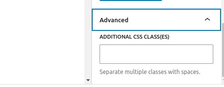
Advanced
Users can add custom class names and style them according to their needs, just like in other blocks.