Url Snippet
Contents
Post Grid Layouts
Post Filter
- Hide Main Title Selection
- Hide Link
- Link Title
- Post Type Selection
- Taxonomy Selection
- Multiple Term Selection
- Background Color
- Choose Background Image
- Padding & Margin
- Heading Settings
- Excerpt Settings
- Author & Date Settings
- Active Term Styling
- Regular Term Styling
- Post Styling
- Hover Effect
- Actions
- Advanced
Post Ticker
Slider
URL Snippet
Parallax
Midnay Patterns
The Share Block provides users with an easy way to share the current page URL. It includes a share button, a copy link button, and a close button for the share dialog popup.
- Share Button: When clicked, it attempts to use the native sharing capabilities of the browser. If the browser does not support the navigator.share API, it displays a custom share dialog
- Close Button: Closes the custom share dialog.
- Copy Button: Copies the current page URL to the clipboard and provides feedback to the user.
This block enhances user engagement by simplifying the sharing process across different platforms and devices.
Add URL Snippet block on edit page

Default Share
When adding this block, the default image will be displayed.

Settings
- Choose Icon Image
Users can choose their preferred icon image from the media library or upload a file.

- After selecting the image, there is a clear icon button to remove the chosen image and return to the default state.

- Share Popup Title Text
Users can easily customize the title of the popup that appears when clicking the icon. By default, it is set to “Share this page”.

Image Settings
- Icon Image Height & Icon Image Width
Here, users can customize the size of the icon in px, rem, vh, vw, em, and %. By default, the size is set to 3rem. We can set different sizes to desk/mobile/tablet.There is also a reset button that restores the icon to its default state.
- The user can style the popup that appears on the front end when the share icon is clicked. You can customize the popup’s background color, text color, button background color, and button text color from the Popup Styles section.


- The user can also style the close icon by adjusting its size and adding a background color etc.
Reset Button
Users can reset all values to their default settings with a single click using the ‘Reset all’ button, which appears in the last section.

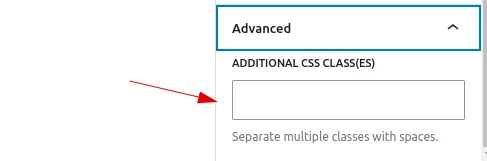
Advanced
Users can add custom class names and style them according to their needs, just like in other blocks.