Post Grid Layouts
Contents
Post Grid Layouts
Post Filter
- Hide Main Title Selection
- Hide Link
- Link Title
- Post Type Selection
- Taxonomy Selection
- Multiple Term Selection
- Background Color
- Choose Background Image
- Padding & Margin
- Heading Settings
- Excerpt Settings
- Author & Date Settings
- Active Term Styling
- Regular Term Styling
- Post Styling
- Hover Effect
- Actions
- Advanced
Post Ticker
Slider
URL Snippet
Parallax
Midnay Patterns
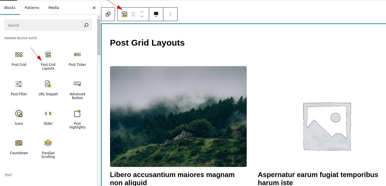
The Post Grid Layouts block allows users to display posts in five different layouts. Posts are shown based on the selected post type and customizable queries. Users can filter posts by taxonomy, terms, order (ascending/descending), and pagination options. Additionally, users can exclude specific posts and customize the styling to fit their needs.
Add post grid Layouts block on edit page
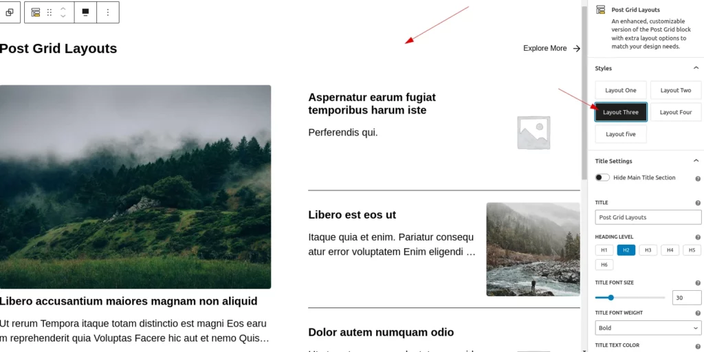
Layout Settings
There are five different layouts available, from which the user can select one based on their design needs. By default, the layout is set to Flex Layout (Normal Row).
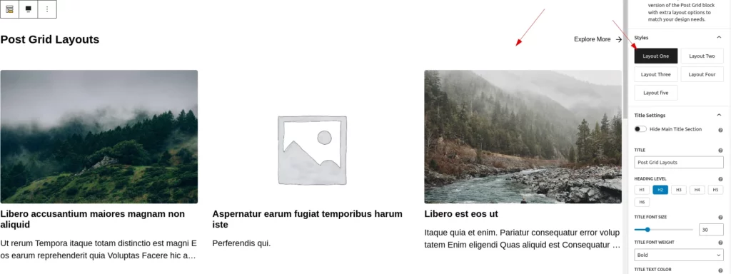
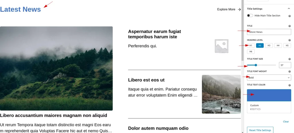
Title Settings
In the title settings, users can fully customize post titles, including text, color, font size, and font weight, with an option to reset to default.
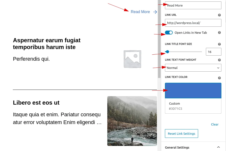
Explore More Links
Users can customize the “Explore More” link by deciding its visibility, changing the link text, adding a URL,Choose whether the link opens in a new tab and styling the link.
- Decide whether to display the link or not
- Customize the link text
- Adjust the link’s font size, weight, and color
- Adjust the link’s font size, weight, and color
- Choose whether the link opens in a new tab
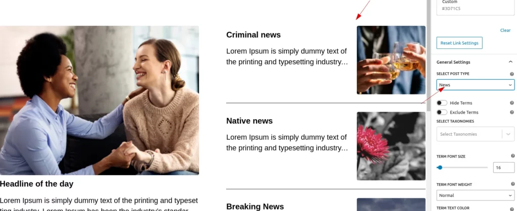
Post Type Selection
Users can change the post type using the selection dropdown, which displays the default “Post” option along with other available custom post types.
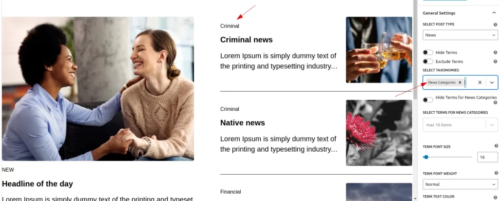
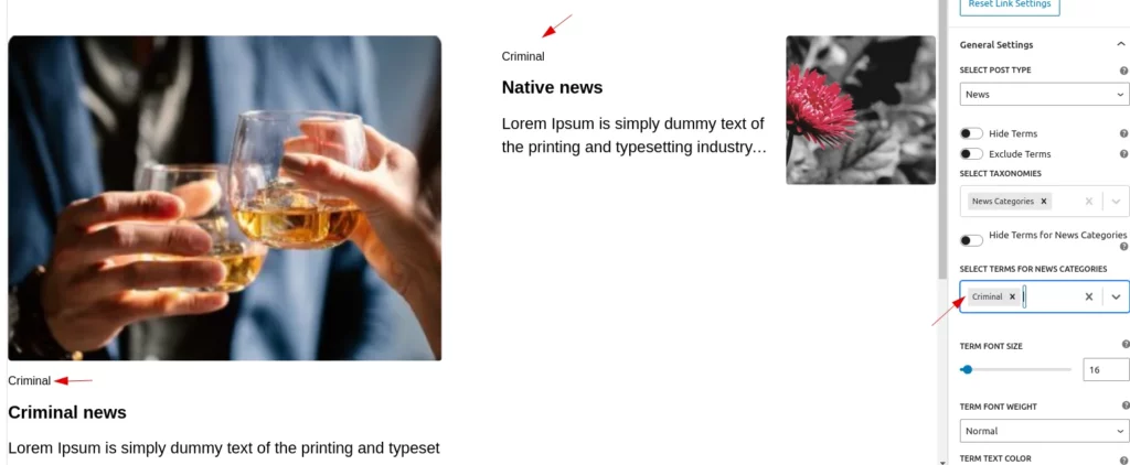
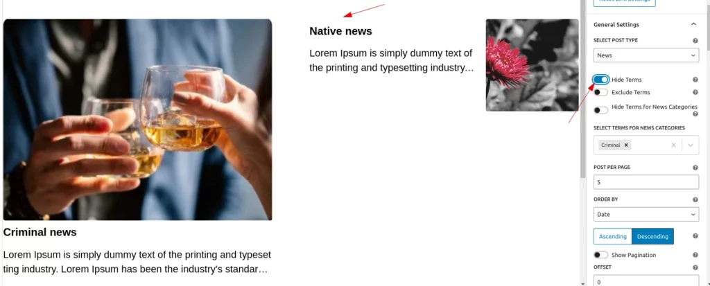
Taxonomy and Terms Selection
Users have the ability to select and customize taxonomies. The customization options include:
- Taxonomy selection
- Terms selection
- Hide Taxonomies: Option to hide specific taxonomies from the display.
- Exclude Taxonomies: Option to exclude certain taxonomies from the list.
- Typography Customization: Adjust typography settings, such as:
- Font Size
- Font Weight
- Text Color
These options allow for greater control over the appearance and display of taxonomies.
- Select Taxonomies
Users can select multiple taxonomies from the dropdown menu.When a taxonomy is selected, the respective terms will be displayed for the post.
- Select terms
After selecting a taxonomy, a dropdown for term selection will appear for each taxonomy. The displayed posts will be filtered based on the selected terms. Additionally, each term dropdown has a toggle to hide or show the options.
- Exclude Terms
If users enable the ‘Exclude Terms’ toggle, the selected terms and the posts related to them will be excluded from the display
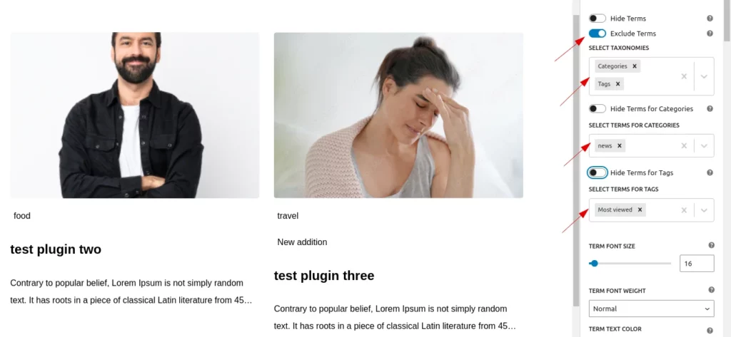
- Hide Taxonomies
There is a toggle button to hide all selected taxonomies if the user wishes to do so.
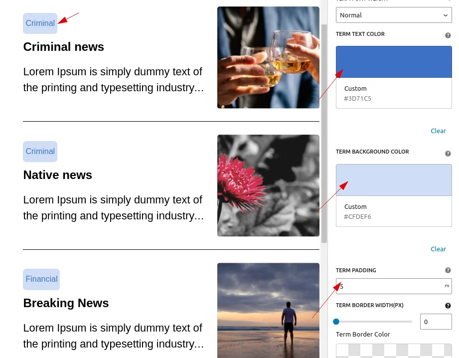
- Style customization
Users can customize the font size, font weight, and text color,backgroun color,border-style of the terms.
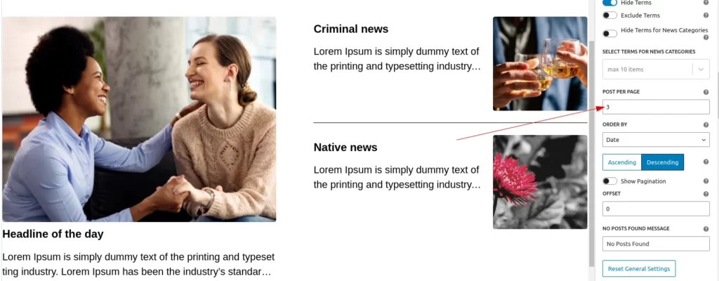
Post Per Page
Users can set the number of posts displayed on the page.
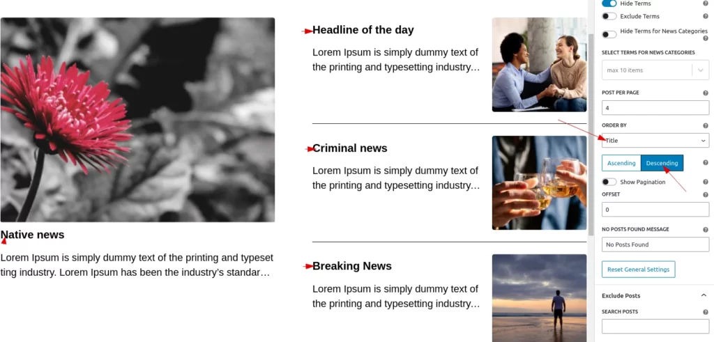
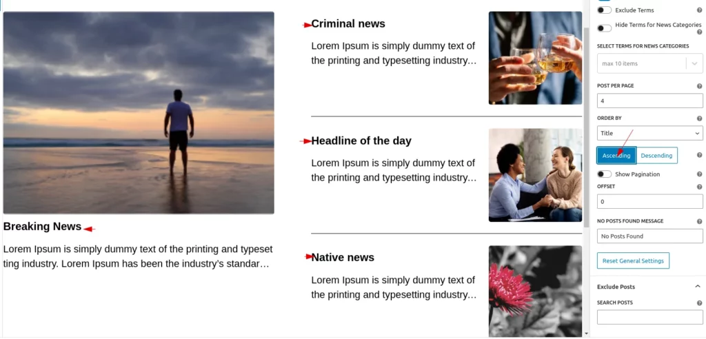
Order and Order by
Users can sort posts by date, title, modified date, or ID. They can also choose whether to display the posts in ascending or descending order.
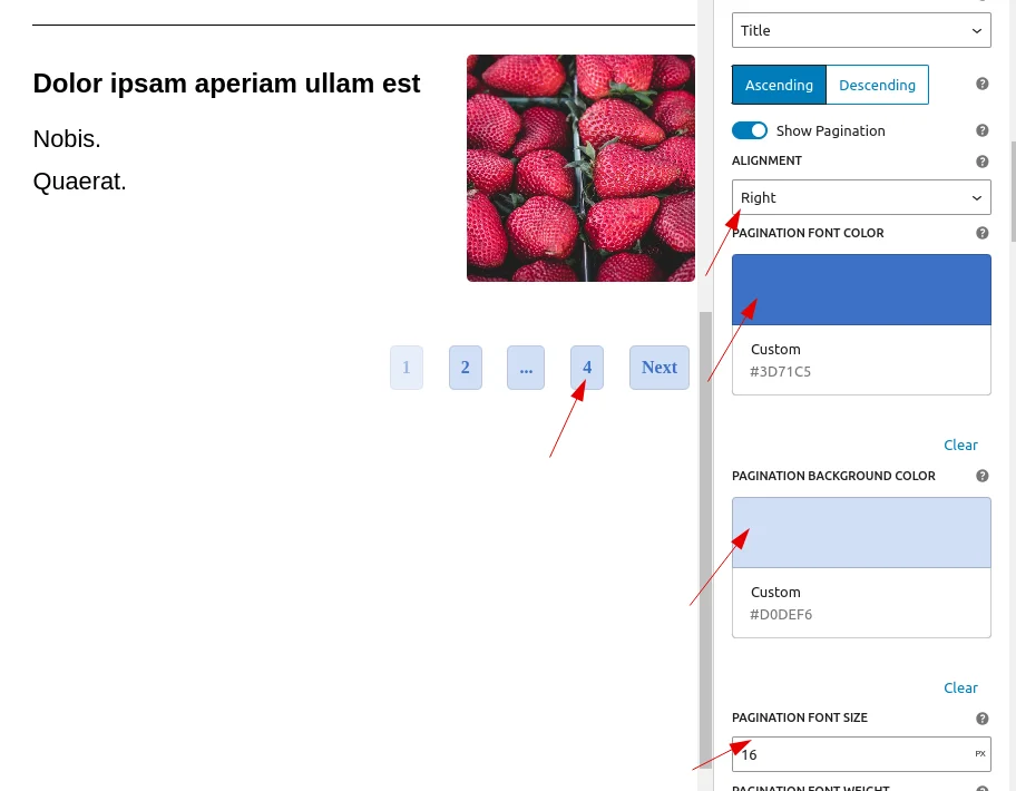
Pagination Settings
There is a toggle button that allows the user to decide whether the pagination is shown or not.
When the user enables the button, additional options appear to style the pagination, including:
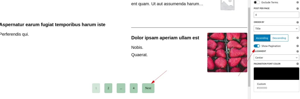
- Pagination alignment
- Pagination text color
- Pagination background color
- Pagination font weight
- Pagination border radius
- Pagination padding
- Pagination margin
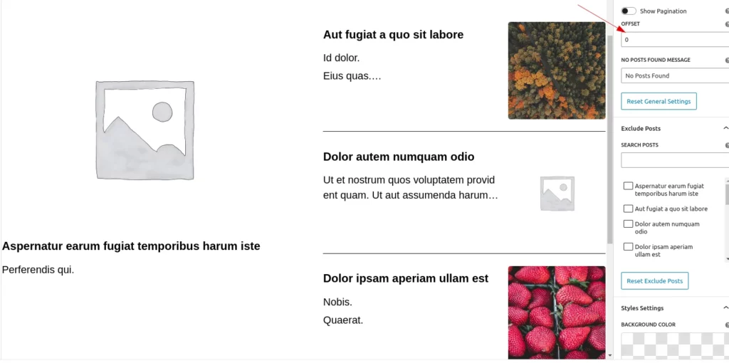
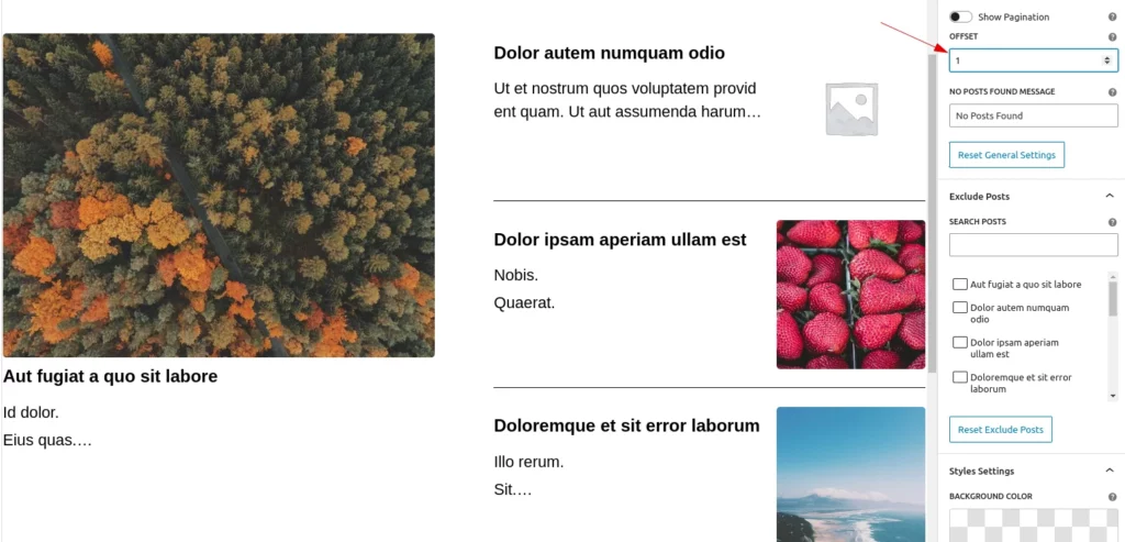
Offset
Offset determines the number of posts to skip before displaying the first post on the page, allowing users to control the starting point of the Posts.
Note: The offset can only be set when pagination is disabled.
After applying offset 2:
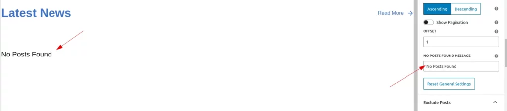
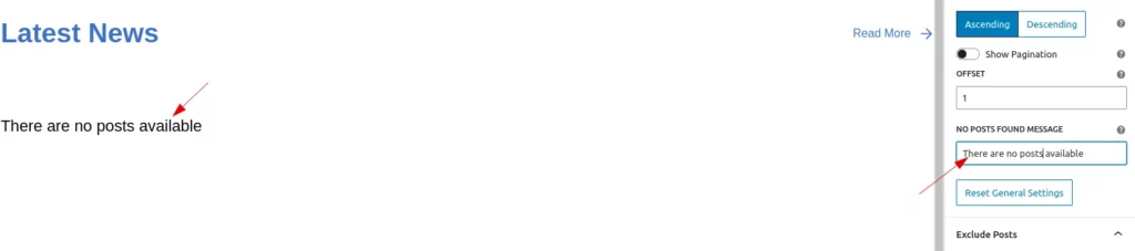
No Post Found
Users can customize the text displayed when no posts are available.
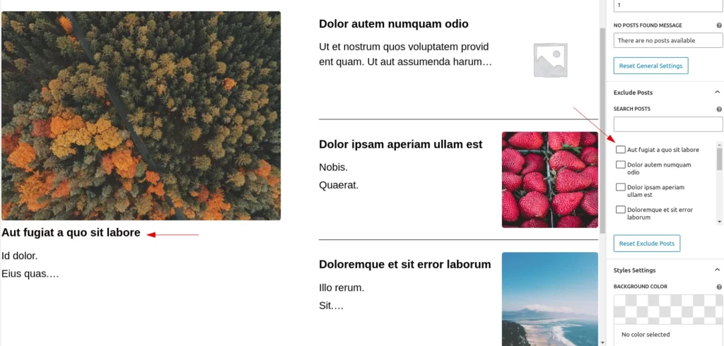
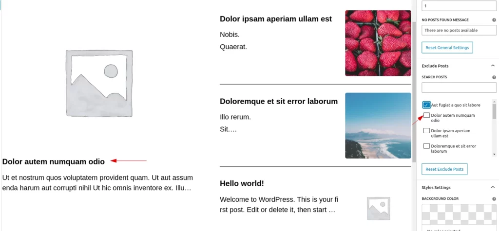
Exclude posts
Exclude Posts allows users to exclude posts by checking the post titles. Users can also search for posts by title to exclude them from the displayed posts
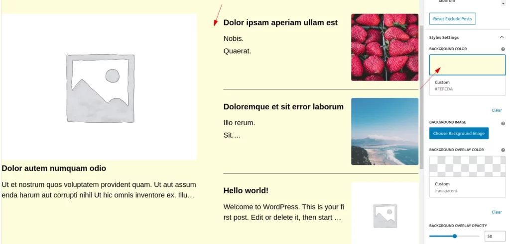
Style Settings
Users can modify and configure the basic style settings here.
- Background Colour
Users can easily customize the background color of the block and can use a clear button to reset the color to default.
Clicking the clear button will reset the color to its default state.
- Background Image
Users can choose a background image from the media library by clicking the ‘Choose Background Image’ button. They can also add an overlay and adjust the overlay’s opacity if needed.
Additionally, there are buttons to change the background image, clear the image, and adjust the overlay color.
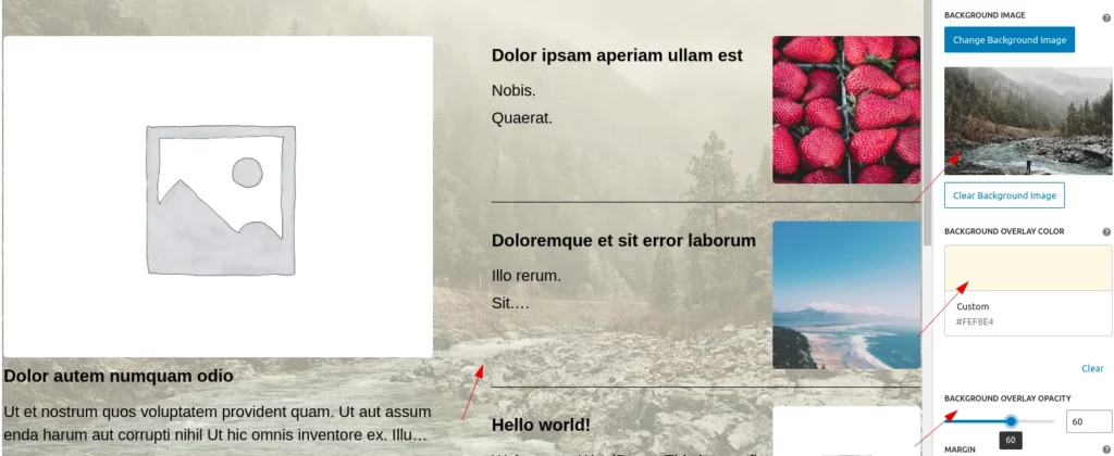
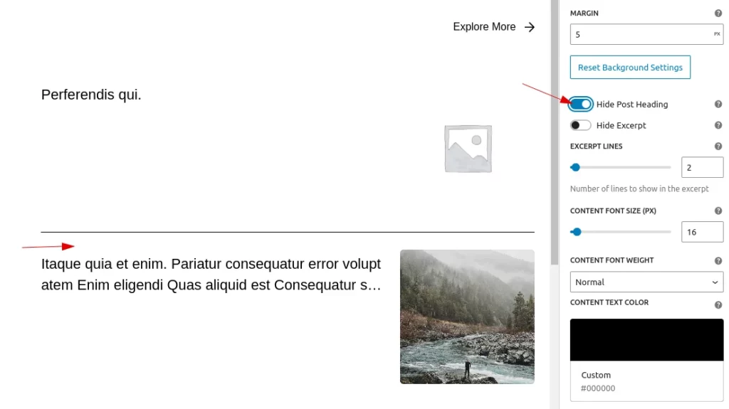
- Margin
Users can easily adjust the spacing settings, such as margin for the top, right, bottom, and left. They can specify these values in either pixels(px),rem,em,% etc units. By default, it is set to 10px.
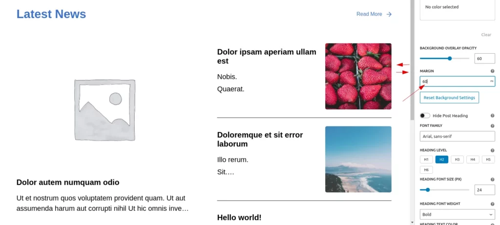
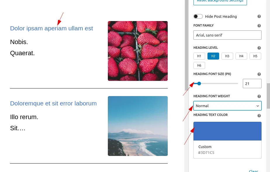
- Hide Post Heading
Users can choose whether to display the heading of the post type. By default, the heading is displayed, but they can toggle it off if needed. When the option to ‘hide the heading’ is enabled, any styles applied under the heading settings will also be removed.
Heading Typography styles are:
- Font-Family
Users can select their preferred font family for post headings. By default, the font is set to “Arial, sans-serif,” but users can customize it according to their preferences. - Font-size
Users can easily customize the heading size by adjusting the font size. By default, it is set to 24px, but users can increase it up to 100px and the minimum value is 10px. - Font-weight
Users can easily customize the font weight of the title to normal, bold, or lighter. By default, the font weight is set to bold. - Text-color
Users can also easily change the title color to suit their preferences.
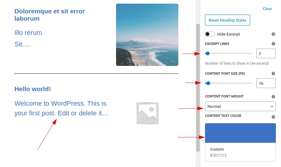
Excerpt Typography styles are:
- Hide Excerpt
Users can choose whether to display the excerpt of the post type. By default, the excerpt is displayed, but they can toggle it off if needed. When the option to ‘hide the excerpt’ is enabled, any styles applied under the excerpt settings will also be removed. - Font-size
Users can easily customize the heading size by adjusting the font size. By default, it is set to 16px, but users can increase it up to 100px and the minimum value is 10px. - Font-weight
Users can easily customize the font weight of the title to normal, bold, or lighter. By default, the font weight is set to normal. - Text-color
Users can also easily change the title color to suit their preferences.
Toggle Buttons for Author Name and Date
By default, the toggle buttons for displaying the Author Name and Date are disabled. You can enable either or both of these toggle buttons as needed.
- Enabling the Author Name or Date: When you enable either the author name toggle or the date toggle, the common styling components for both will be applied.
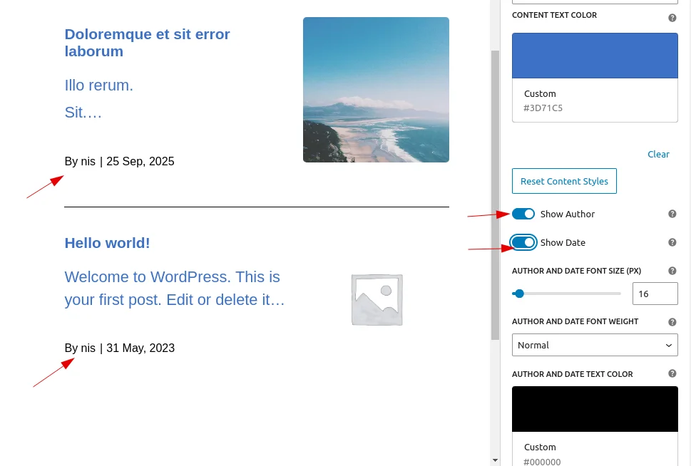
- Common Styling: The styling will be shared for both the author name and the date once any of the toggles are enabled.
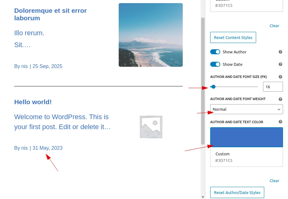
Both toggles can be enabled independently, and the styling will apply accordingly to whichever option is enabled.
Post Styling
Users can add a background color or image, apply an overlay to the background image, and set border, padding, and margin for each post (these settings will apply to all posts within the block).
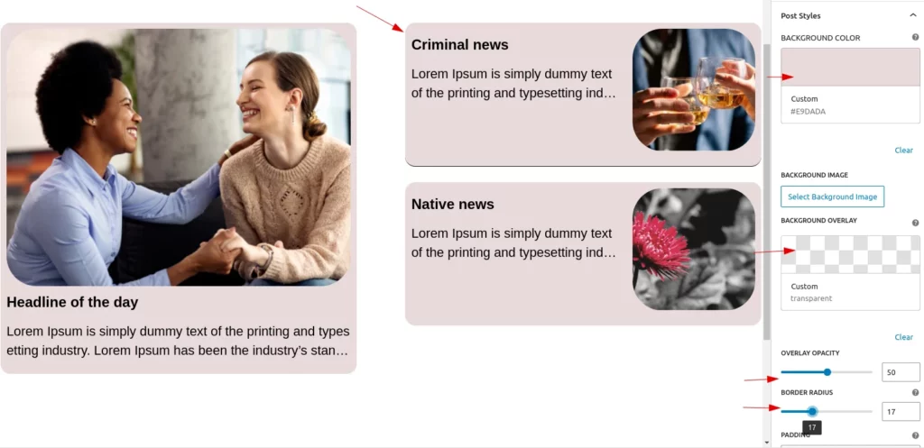
Image Settings
This setting allows users to customize the featured images on the post types.
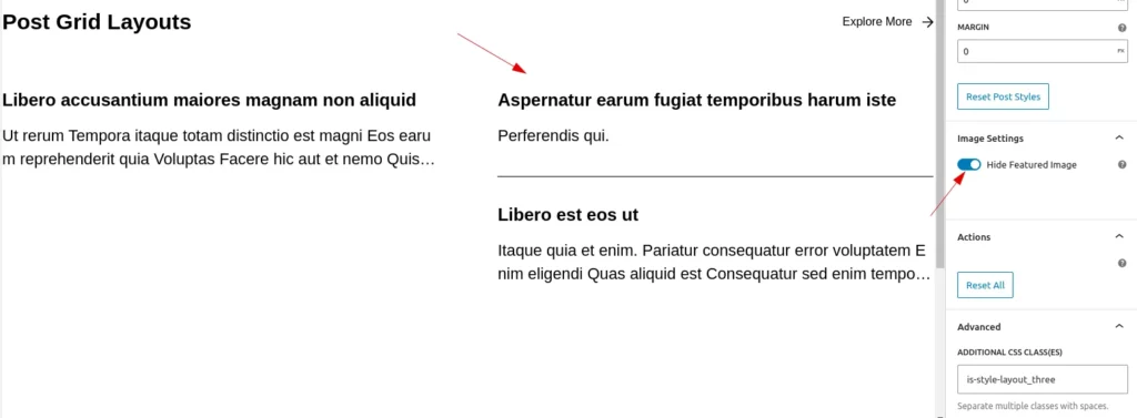
- Hide Featured Image
Users can hide the featured image based on their needs. When the image is hidden, the associated styles for the image at the bottom will also be hidden.
- Border radius
Users can add a border radius to the featured images. By default, it is set to 5px, but users can customize it using percentage, pixels, or rem values.
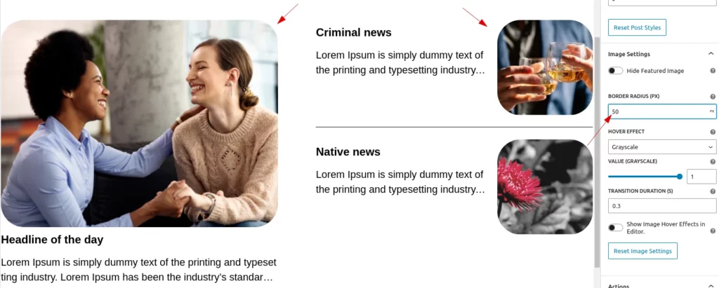
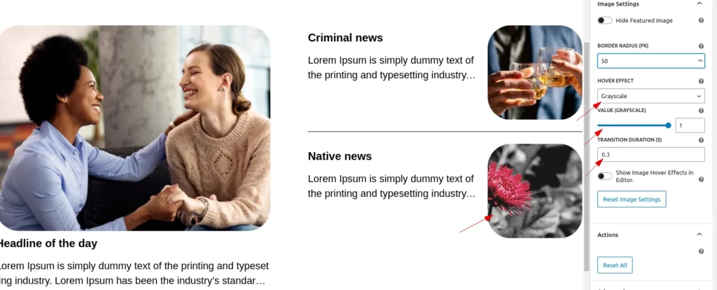
- Hover Effects
Users can add hover effects to images and customize their properties.default value is grayscale. The available options and functionality include:- Hover Effects:
- Grayscale: Adjust the intensity (default value is 1 for maximum grayscale). Decrease the value to reduce the grayscale effect.
- Scale: Adjust the scaling factor to increase or decrease the image size.
- Rotate: Apply a slight rotation (default value is 1). Decrease the value to reduce the rotation effect.
- Opacity: Control transparency (default value is 1 for full opacity). Decrease the value to reduce opacity.
- Property Value Adjustment:
- Use the range control to adjust the effect intensity for the selected hover style.
- The range control is only displayed when a hover style is selected.
- Transition Customization:
- Set the transition duration to control the smoothness of the hover effect.The default transition value is 0.3.
- Hover Effects:
- Toggle Button for Show hover
This toggle button allows users to enable hover effects in the backend. When enabled, it may also redirect the link within the backend. For this reason, it is disabled by default.
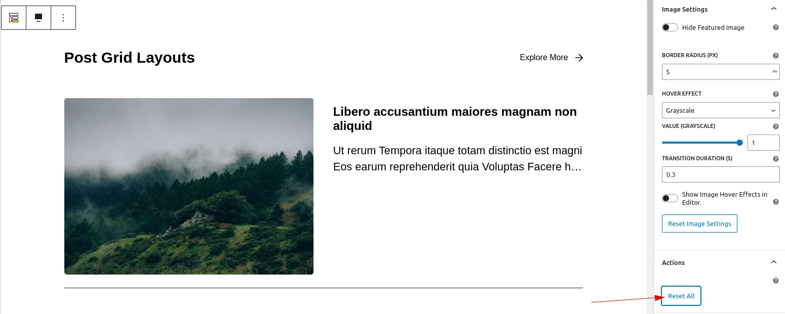
Reset Button
Users can reset all values to their default settings with a single click using the ‘Reset all’ button, which appears in the last section.
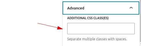
Advanced
Users can add custom class names and style them according to their needs, just like in other blocks.