Post Filter
Contents
Post Grid Layouts
Post Filter
- Hide Main Title Selection
- Hide Link
- Link Title
- Post Type Selection
- Taxonomy Selection
- Multiple Term Selection
- Background Color
- Choose Background Image
- Padding & Margin
- Heading Settings
- Excerpt Settings
- Author & Date Settings
- Active Term Styling
- Regular Term Styling
- Post Styling
- Hover Effect
- Actions
- Advanced
Post Ticker
Slider
URL Snippet
Parallax
Midnay Patterns
The Filter block allows users to filter posts by selected categories, tags, or other taxonomies, making it easier to discover and navigate content. You can customize the appearance of the Filter block, including colors, typography, and more, to seamlessly integrate it into your site’s design. This feature enhances user experience by enabling quick and efficient content filtering based on specific criteria.
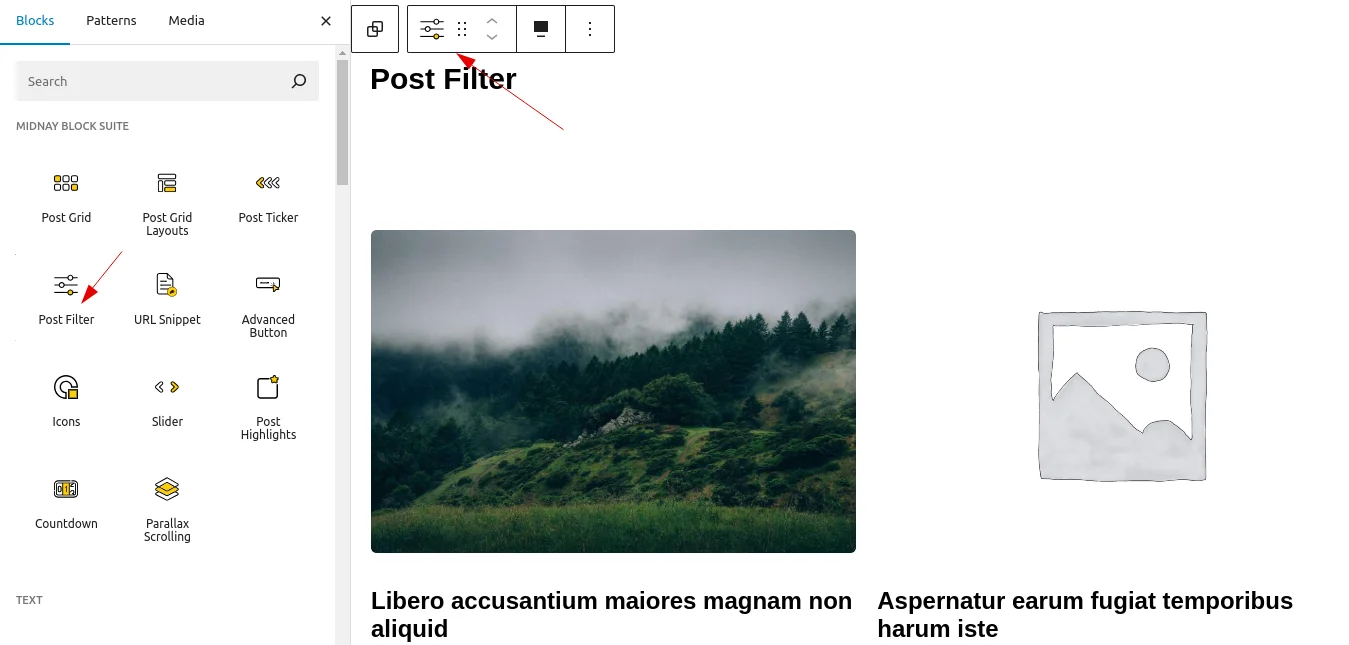
Step 1:
Add Post Filter block on edit page.
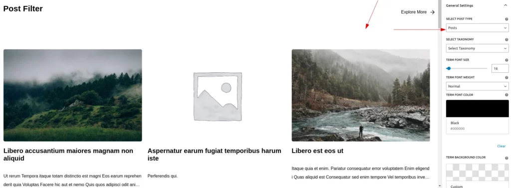
Step 2:
By default, the posts on the website are displayed.
This block includes different style settings:
Step 3:
1.Settings
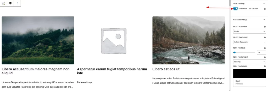
Hide Main Title Section
This toggle button allows the user to hide the entire title section. When enabled, all title customization settings will also be hidden.
Title
In this feature, the user can easily customize the block’s title name. By default, the title is set to ‘Post Filter’. Additionally, a clear button is provided, allowing the user to reset the title to its default state.
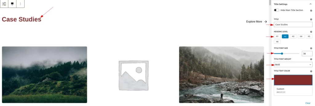
Heading Level
The user can easily set the title’s heading level from H1 to H6, with H2 as the default.
Title Font Size
In this feature, the user can easily customize the font size of the block’s title. By default, the font size is set to 30px. The user can adjust the size within a range, with a minimum value of 10px and a maximum value of 100px.
Title Font Weight
In this feature, the user can easily customize the font weight of the title. By default, the font weight is set to ‘Bold’. The user can choose from three options: ‘Normal’, ‘Bold’, and ‘Lighter’.
Title Font Color
In this feature, the user can easily customize the title’s font color. By default, the font color is set to black. Additionally, a clear button is included, enabling the user to reset the font color to its default state.
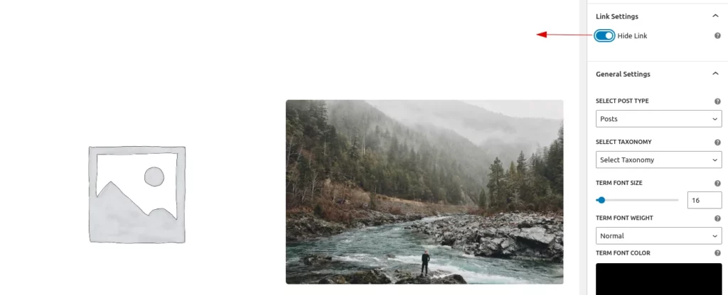
Hide Link
This feature allows users to hide the “Explore More” link. When hidden, the styles and customizations applied to the “Explore More” link are also removed. By default, the toggle is set to “off.”
Link Title
In this feature, the user can easily customize the link’s title. By default, the title is ‘Explore More->’. Additionally, a clear button is included, enabling the user to reset the title to its default state.
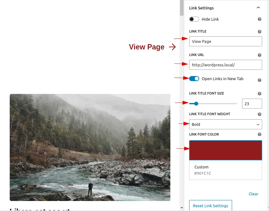
Link Title URL
In this feature, the user can easily customize the URL to navigate to. By default, it will be set to ‘#’.
Link Title Font size, Link Title Font Color & Link Title Font Weight
Link Title Font Size: Users can easily customize the font size of the link text. By default, the font size is set to 16px. The size can range from a minimum of 10px to a maximum of 100px.
Link Title Font Color: Users can easily customize the color of the link. By default, the color is black.
Link Title Font Weight: Users can easily customize the font weight to “Normal,” “Bold,” or “Lighter.” By default, it is set to “Normal.”
There is a reset button that restores these features to their default state.
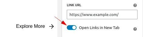
Open Links In New Tab Toggle
The user can easily customize whether the link opens in a new tab or the current page by enabling this feature. By default, it is turned off.
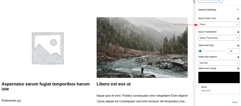
Post Type Selection
Select Post Type: Users can change the post type using the selection dropdown, which displays “Posts” as the default option along with other available custom post types.
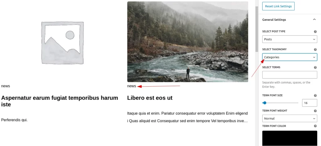
Taxonomy Selection
Select Post Type: Users can easily select and display taxonomies appropriate to the chosen post type.
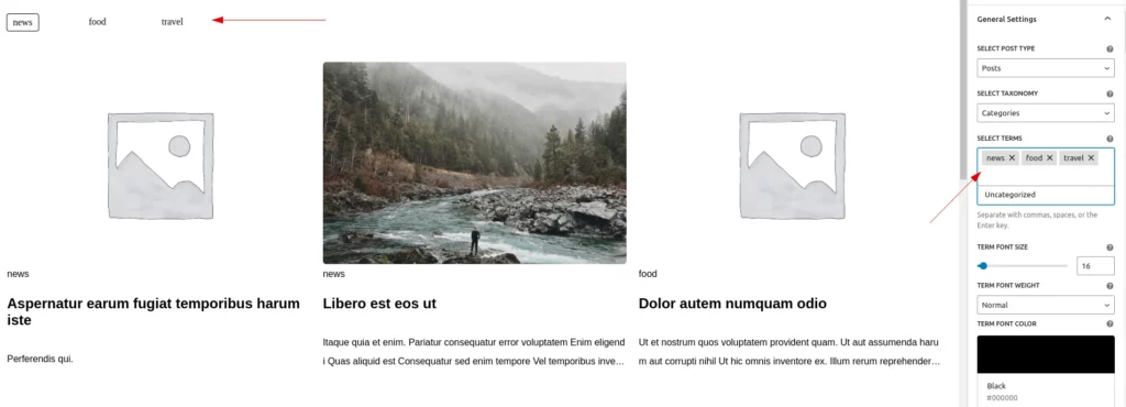
Multiple Term Selection
Select Terms:Users can easily select terms from the chosen taxonomy. They can choose from a dropdown or search and select the desired terms.
Term Font Size, Term Font Color & Term Font Weight
Term font size:Users can easily customize the font size of the selected terms. By default, the font size is set to 16px. The size can range from a minimum of 10px to a maximum of 100px.
Term font color:Users can easily customize the color of the link. By default, the color is black.
Term Font Weight: Users can easily customize the font weight to “Normal,” “Bold,” or “Lighter.” By default, it is set to “Normal.”
There is a reset button that restores these features to their default state.
Step 4:
2.Style Settings
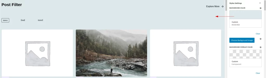
Background Color
This feature allows users to easily set the background color of a block. By default, the background is transparent. A “Clear” button is also provided to reset it to the default color.
Choose Background Image
The user can easily set an image as the background of a block. A clear button is available to remove the selected image.
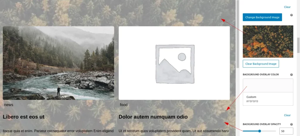
Background Overlay opacity: User can adjust the background overlay opacity for better customization.
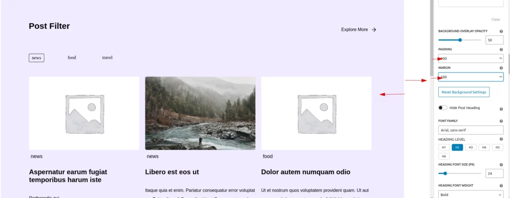
Padding & Margin
The user can easily adjust the margin and padding values, with both set to 10px by default. They can customize these values as needed using units such as px, rem, em, %, vh, and vw. A reset button is also available to restore the values to their default state.
Heading Settings
The user can easily customize the post heading.
Heading Level: The user can easily set the title’s heading level from H1 to H6, with H2 as the default.
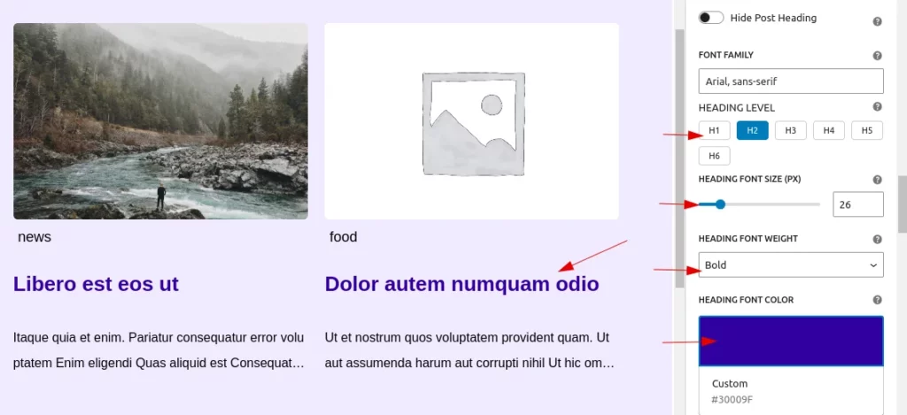
Hide Post Heading: A toggle button allows the user to hide the post heading. They can easily enable or disable it as needed. When the toggle is enabled, all heading customization options will also be hidden.
Font Family: The user can add their preferred font family, with the default set to Arial, sans-serif.
Heading Font Size: The user can customize the font size of the post heading, ranging from a minimum of 10px to a maximum of 100px, with a default size of 24px.
Heading Font Weight: The user can adjust the font weight of the post heading to normal, bold, or lighter, with bold as the default setting.
Heading Font Color: The user can customize the heading color, with the default set to black.Additionally a clear button along with it, which resets to default state.
Excerpt Settings
The user can easily customize the post excerpt.
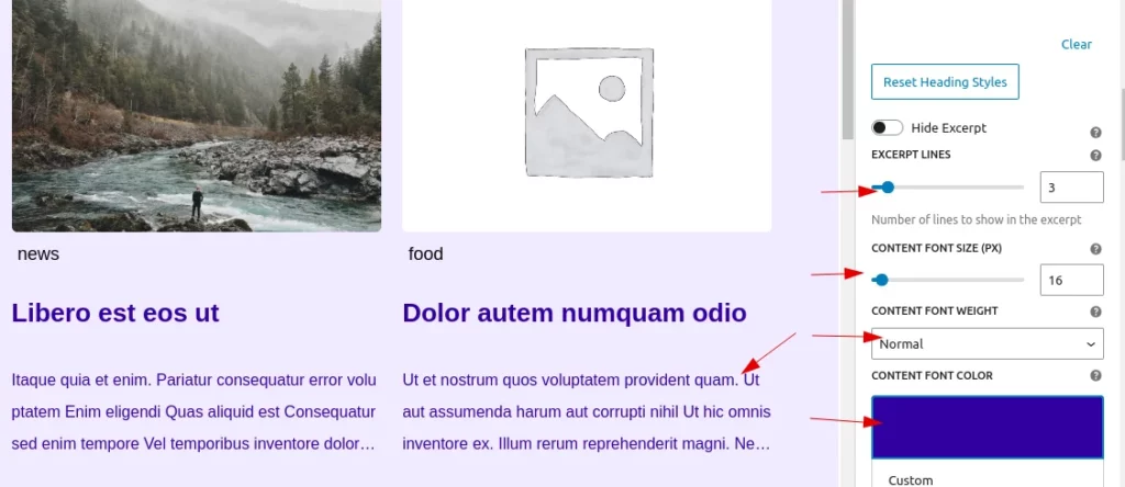
Hide Post Excerpt: A toggle button allows the user to hide the post excerpt. They can easily enable or disable it as needed. When the toggle is enabled, all excerpt customization options will also be hidden.
Content Font Size: The user can customize the font size of the post excerpt, ranging from a minimum of 10px to a maximum of 100px, with a default size of 16px.
Content Font Weight: The user can adjust the font weight of the post excerpt to normal, bold, or lighter, with normal as the default setting.
Content Font Color: The user can customize the content color, with the default set to black.Additionally a clear button along with it, which resets to default state.
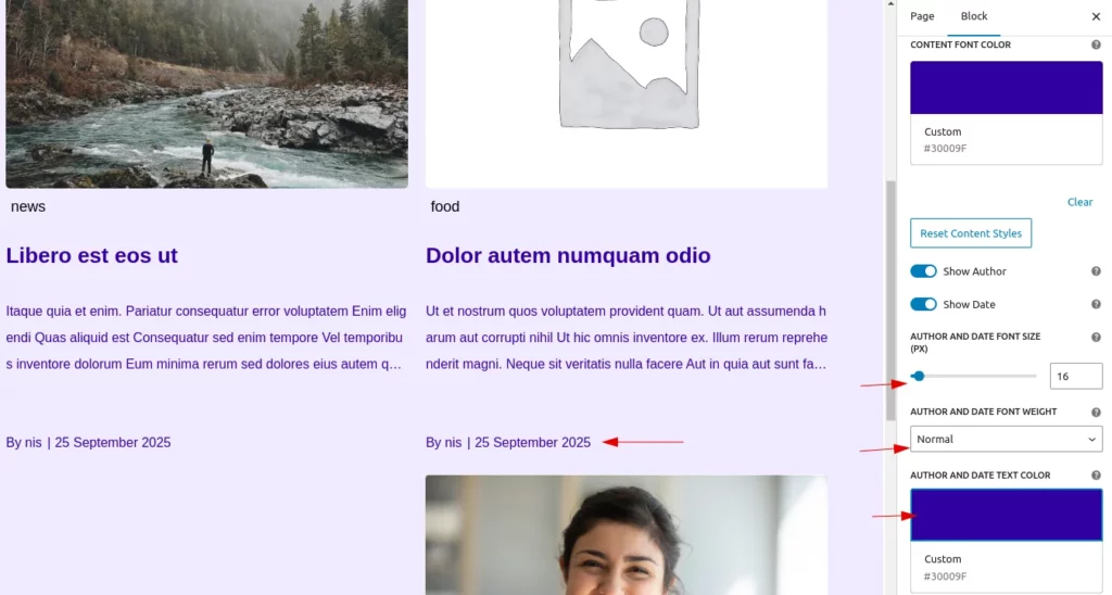
Author & Date Settings
There are two toggle options for displaying the author’s name and the post date. When enabled, the author name and date will be displayed, along with their customization options. By default, both toggles are set to false.
Author and Date Font Size: The user can customize the font size, ranging from a minimum of 10px to a maximum of 100px, with a default size of 16px.
Author and Date Font Weight: The user can adjust the font weight to normal, bold, or lighter, with normal as the default setting.
Author and Date Font Color: The user can customize the color, with the default set to black. Additionally, a clear button is available to reset the settings to their default state.
Step 5:
3.Filter Terms Styling
Active Term Styling
Customize the visual presentation of Active Terms (terms that are currently selected or in use). You can adjust the following properties:
- Active Term Text Color: Choose the color for the text of active terms.
- Active Term Border Color: Adjust the color of the border surrounding active terms.
- Active Term Background Color: Set the background color for active terms. This can be transparent or any color you prefer.
- Border Width: Control the width of the border around the active term.
- Border Radius: Adjust the roundness of the corners of the border for the active term. You can choose pixel values or percentage values for more flexibility.
- Padding: Set padding in CSS format (e.g., 5px 10px or 5px 10px 5px 10px) to control the spacing inside the active term.
You also have a Reset Active Term Styles button that restores all active term styles to their default values:
- Border Width: 1px
- Padding: 5px 10px
- Border Radius: 4px
- Text Color: #000000 (Black)
- Border Color: #000000 (Black)
- Background Color: Transparent
Regular Term Styling
Here, you can style Regular Terms (terms that are not active or selected). You can adjust the following properties:
- Term Font Size: Adjust the font size of regular terms, ranging from 10px to 100px.
- Term Font Weight: Choose the font weight for regular terms (Normal, Bold, or Lighter).
- Term Text Color: Choose the color for the text of regular terms.
Additionally, you have a Reset All Filter Term Styles button that restores all filter term styles (both Active and Regular) to their default values:
- Active term styles reset to default values as described above.
- Regular term font size: 16px
- Regular term font weight: Normal
- Regular term text color: #000000 (Black)
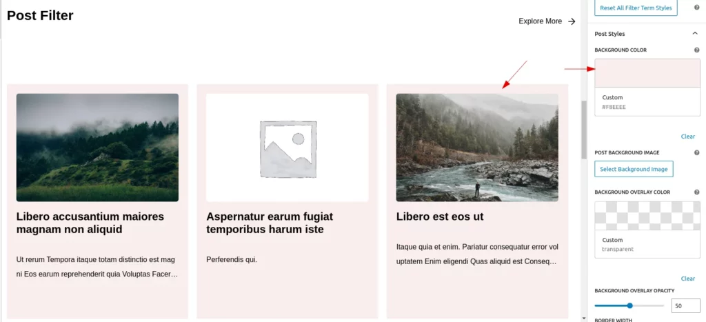
Post Styling
Users can add a background color or image, apply an overlay to the background image, and set border, padding, and margin for each post (these settings will apply to all posts within the block).
Step 6:
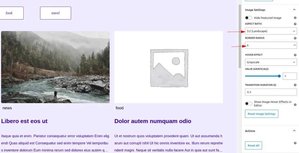
4.Image Settings
Users can easily customize the featured image of a post through the Image Settings.
Hide Featured Image: This toggle button allows users to hide the featured image. When the image is hidden, all customization options related to it are also removed.
Border Radius: Users can adjust the border radius of the image using various units such as px, %, rem, em, vh, and vw. By default, it is set to 5px. A reset button is available to restore the default setting.
Hover Effect
This functionality allows users to add hover effects to images. If the image is not hidden, users can select a hover effect (None, Grayscale, Scale, Rotate, or Opacity) from a dropdown. When an effect is chosen, a range control appears to adjust its intensity, with specific limits based on the effect type. Additionally, users can set a transition duration in seconds.
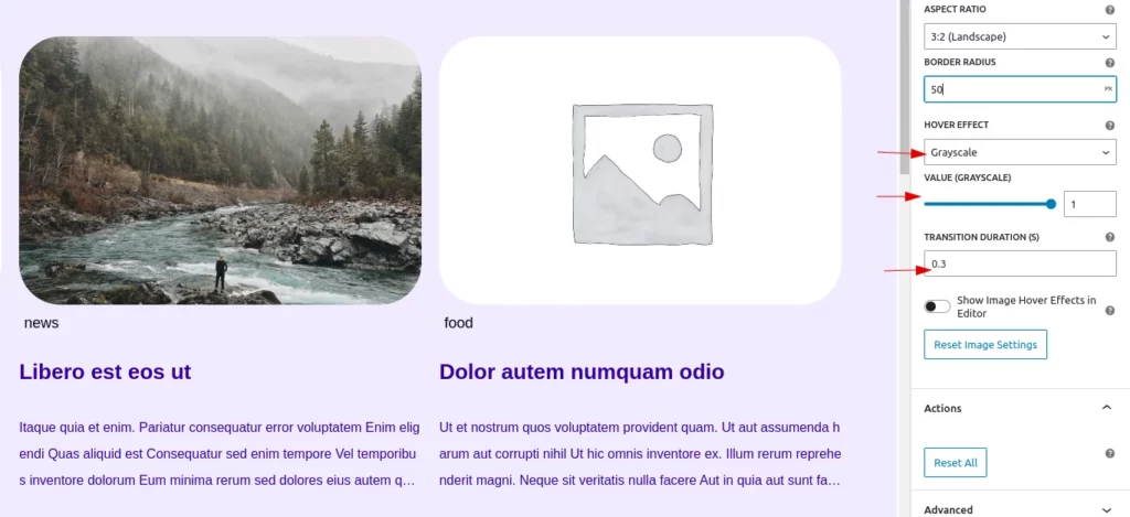
A toggle option is provided to enable hover effects in the editor, which may activate link redirections.
Step 7:
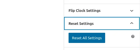
5.Actions
The “Reset All” button allows users to restore all settings to their default values. When clicked, it resets attributes related to titles, fonts, colors, layout, spacing, visibility options, hover effects, and filtering preferences.This helps users quickly revert to the default configuration if needed.
Step 8:
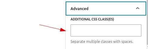
6.Advanced
Users can add custom class names and style them according to their needs, just like in other blocks.